
Branding Cowboy Space Corp
Get in loser we're going to low Earth orbit.

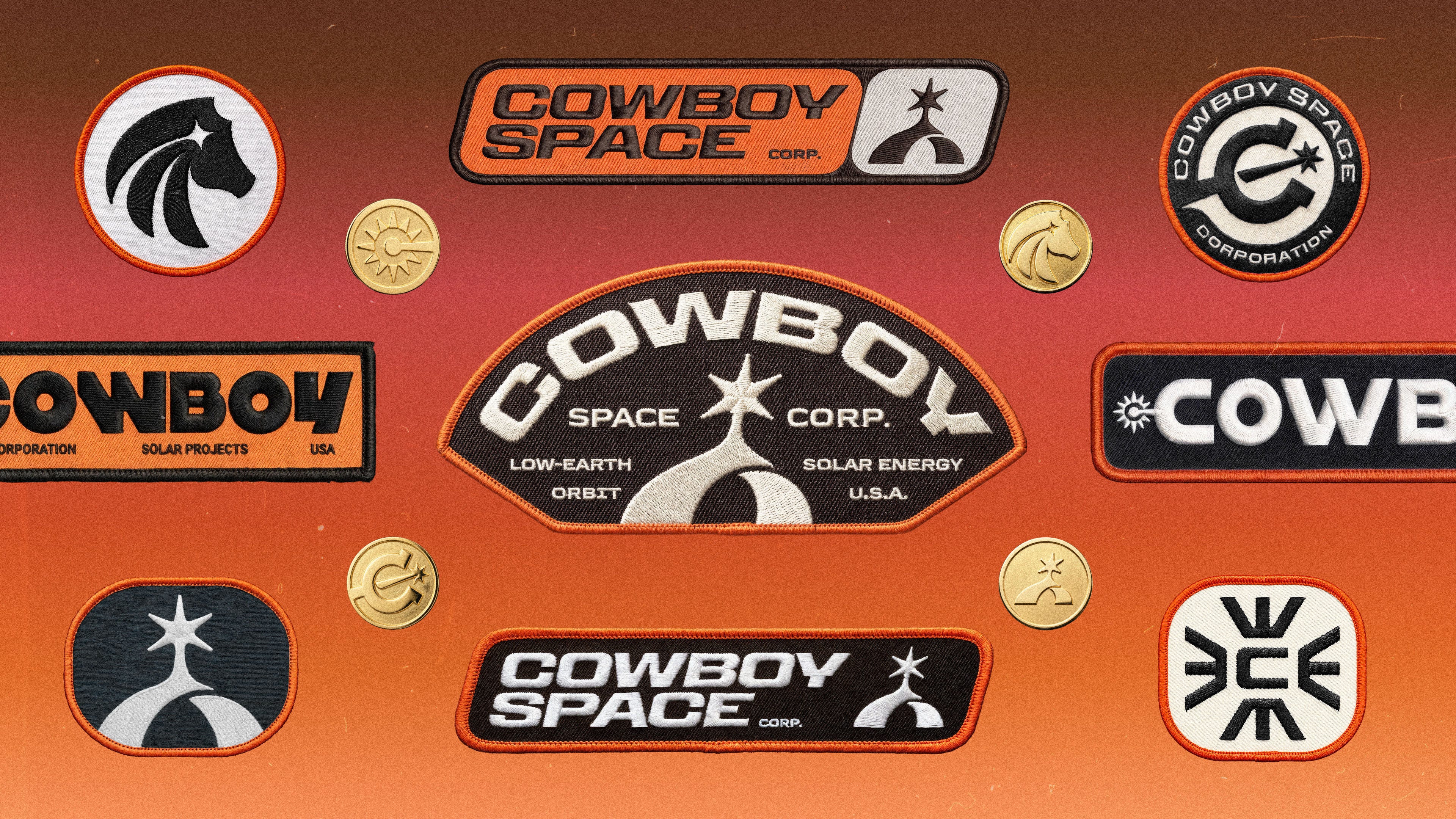
It’s not every day you get an email asking you to create a brand for a rocket that’s launching a satellite into the atmosphere. When I got the email my first thought was, “No wayyyyy. NO WAYYYYY. WE’RE GOING TO BRAND A ROCKET…IN SPACE?!” My second thought was much more composed, “Yes, we’d love to discuss the potential of working together.”
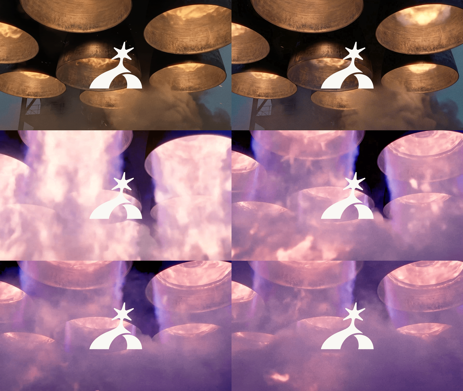
This project was a quick one. A really small scope just to get an identity together for a big announcement. Logo, type, colors. Bare bones. But because it’s a field we’re so deeply interested in, we wanted to go all out. And once we heard it was going to be called Cowboy Space Corp., we were like wow, that’s insane and awesome.
Yeehaw brother. Let’s get to it.
The Symbol
Just a little yee, not so much haw.
Cowboy, formerly known as Aetherflux, is the brainchild of Baiju Bhatt, (cofounder of Robinhood). And they are staffed with some incredible talent like: Joe Yaffe, Tyler Grinnell, Andrew Yarmola, Elliot Slade, and David Larson. They started Cowboy Space Corp. as an answer to the looming AI energy crisis.
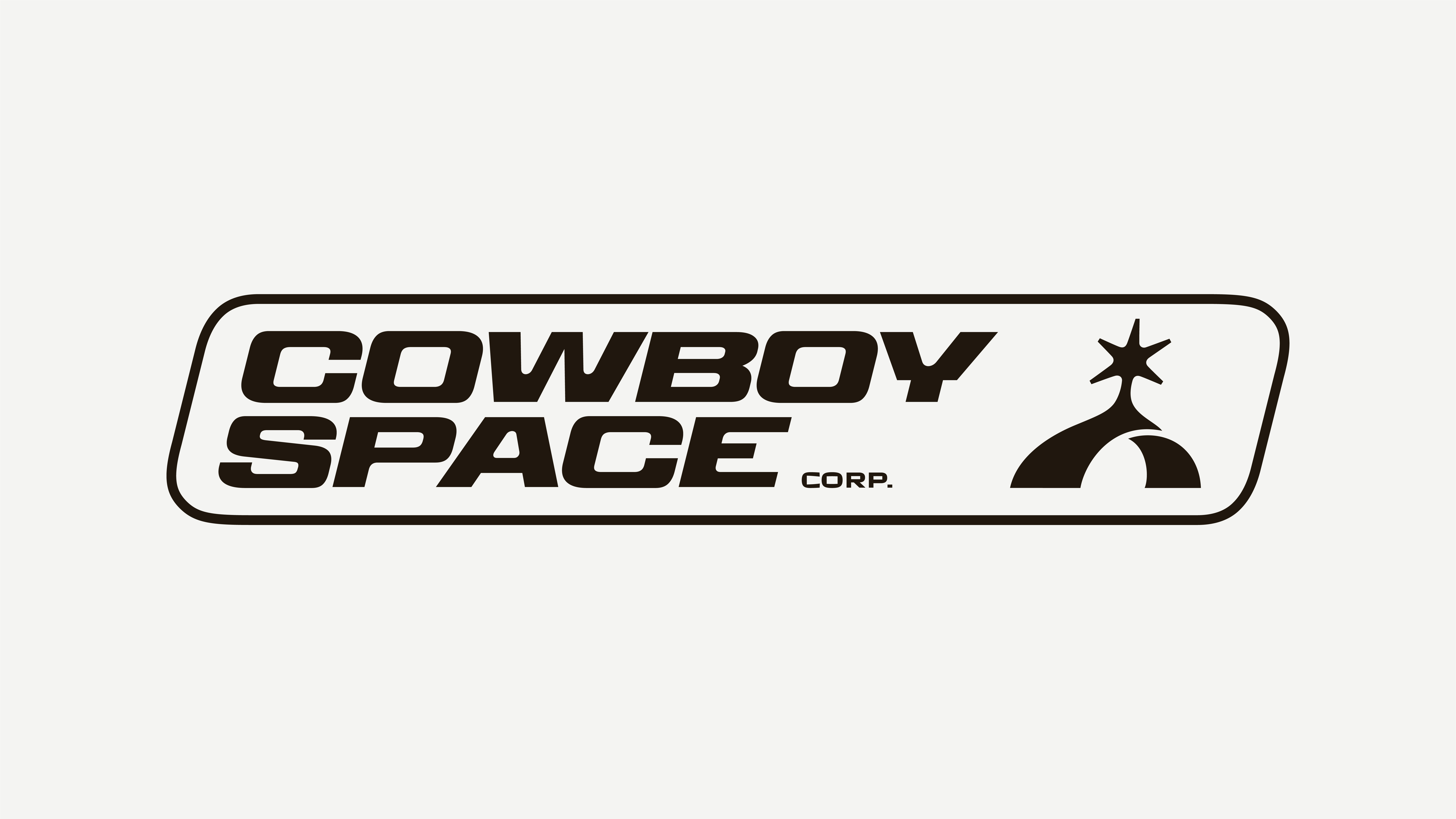
Here’s the pitch in their words:
Access to energy is one of the primary bottlenecks for scaling artificial intelligence. This problem is driven by infrastructure timelines. Securing real estate, establishing utility connections, and constructing new data centers can take more than half a decade.
Cowboy Space Corp. is building an orbital data center satellite that leverages solar power in space to address the massive energy needs for artificial intelligence. A constellation of these satellites dubbed “Stampede” working together will scale the next generation of compute workloads in orbit.
In other (my) words, they’re building a network of solar panel satellites that will float in low Earth orbit, with direct access to the sun’s full power 24/7. Then they’ll transfer the collected energy down to Earth. Super easy stuff, can’t believe I never thought of it. JK the team over there literally have doctorate degrees in math and science. An absolute powerhouse, pun intended.
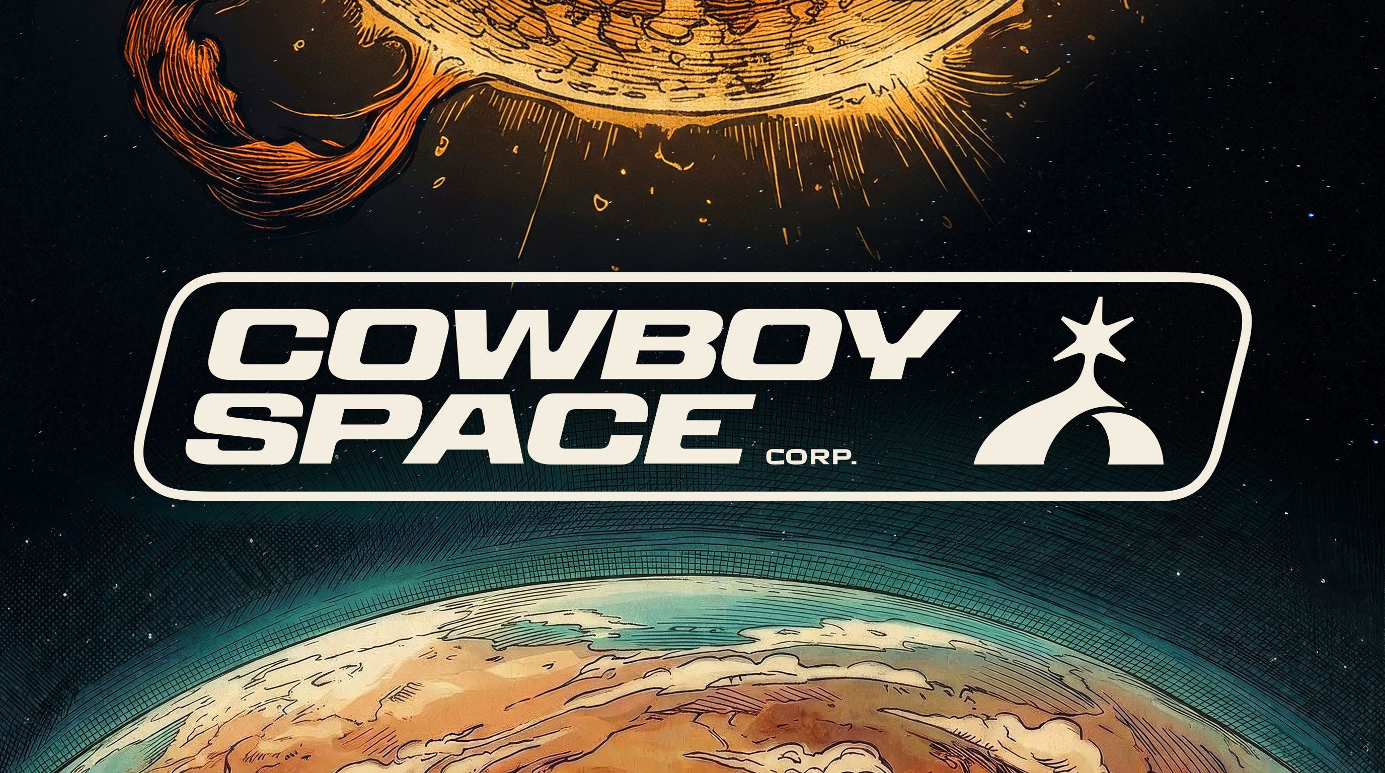
The wild west of outer space.
Now that you’ve got the context, hopefully the logo makes a bit more sense. With a name like Cowboy Space Corp., we had lots of visually-rich metaphors to lean on: horseshoes, sheriff badges, bandanas, cowboy hats, lassos, horses, spurs, saddles, bulls, revolvers, the list goes on and on. And pretty quickly, we started exploring the idea of a spur that’s also a sun.
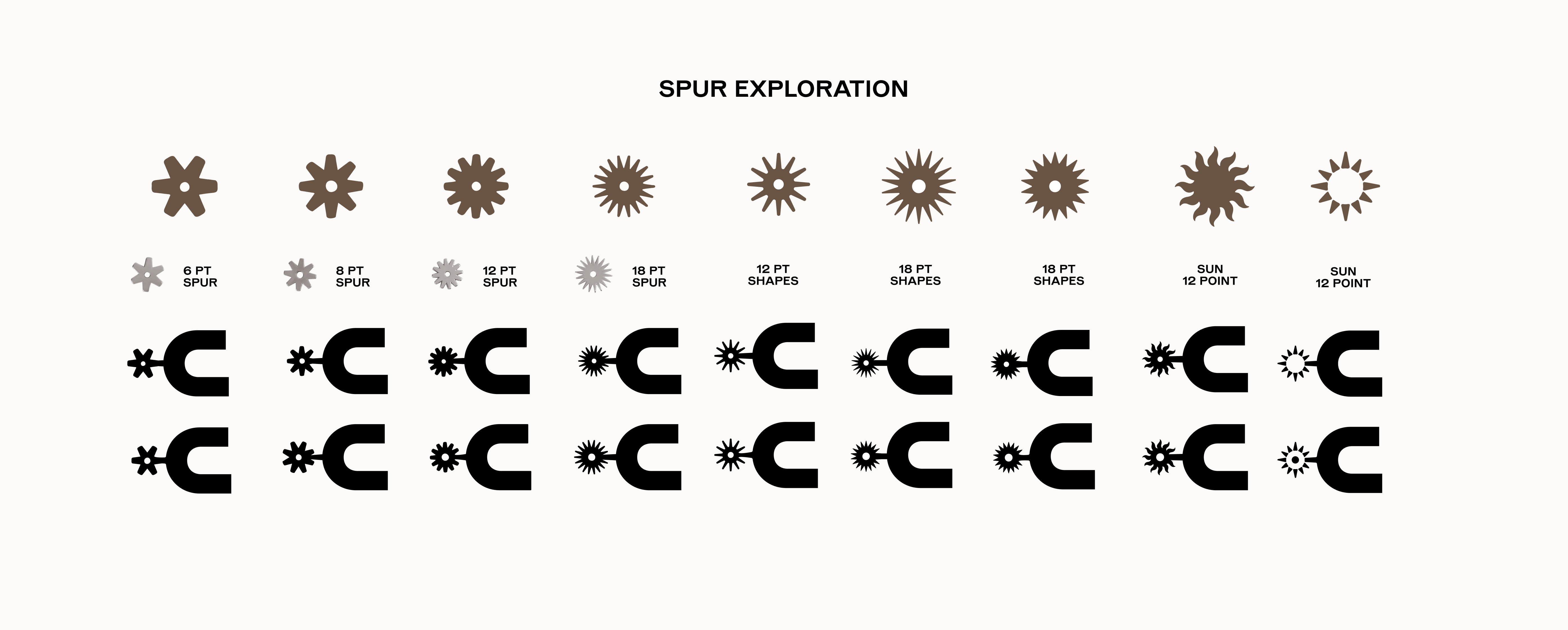
But the challenge with these kinds of logos is that sometimes what you make has the potential to be iconic, smart, and clever. And sometimes it can just come across as cheap, obvious, or a joke. Delicate balance there. Def don’t want a space company’s logo to be too over the top yeehaw. Still has to feel responsible. Just a little bit of a hat tip, if you will.
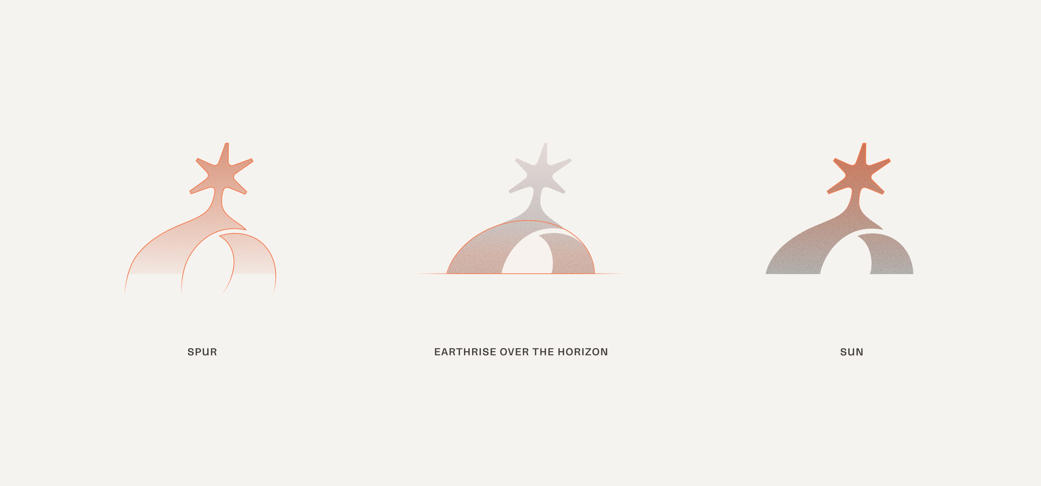
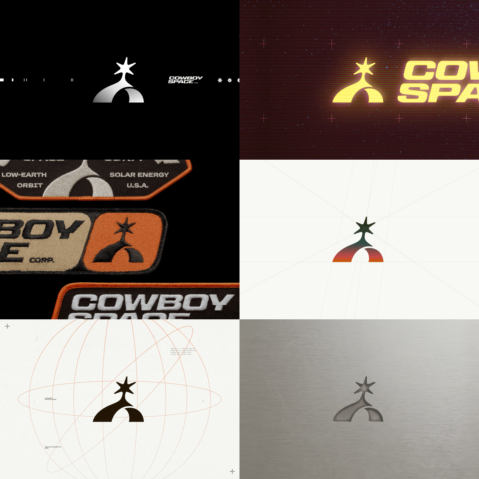
Symbol breakdown: A little lean and a lot of love.
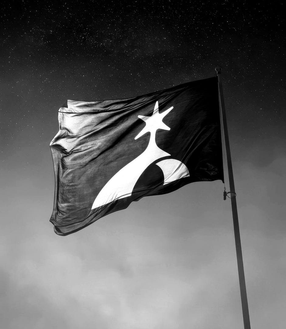
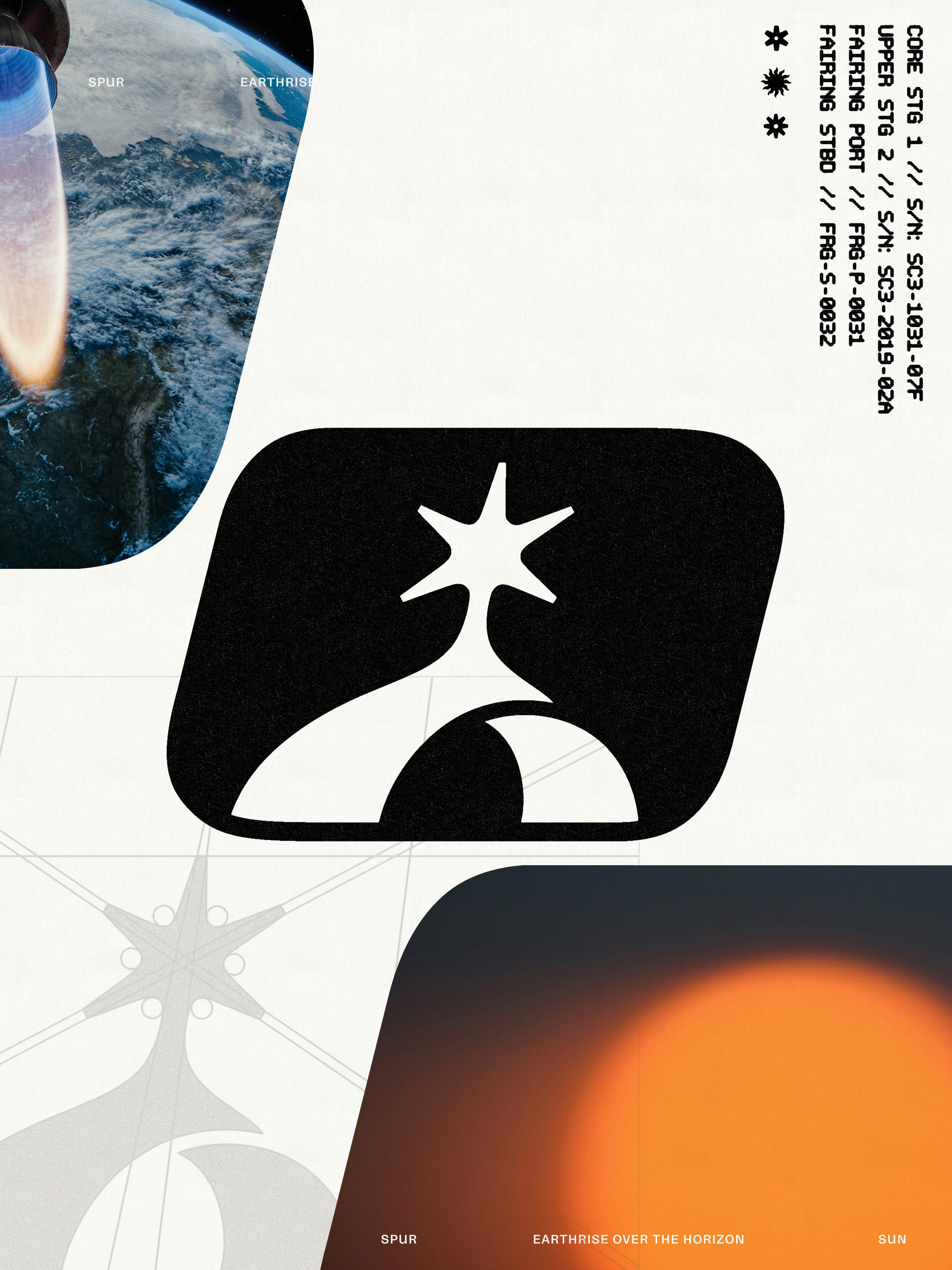
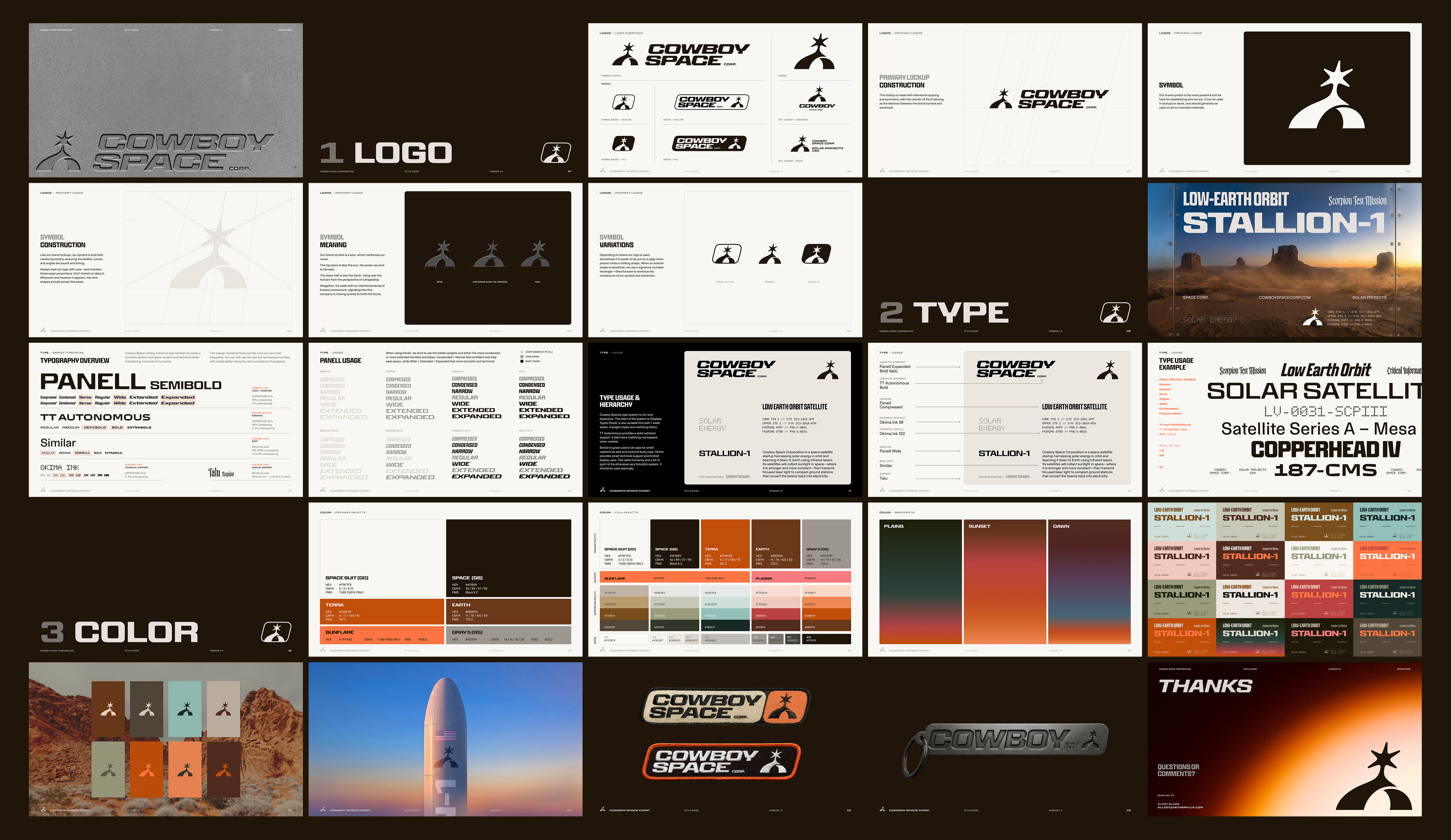
The final symbol can be seen as an upright spur, but when you look a little closer, there’s also a sun rising over Earth’s horizon, with energy flowing back and forth.
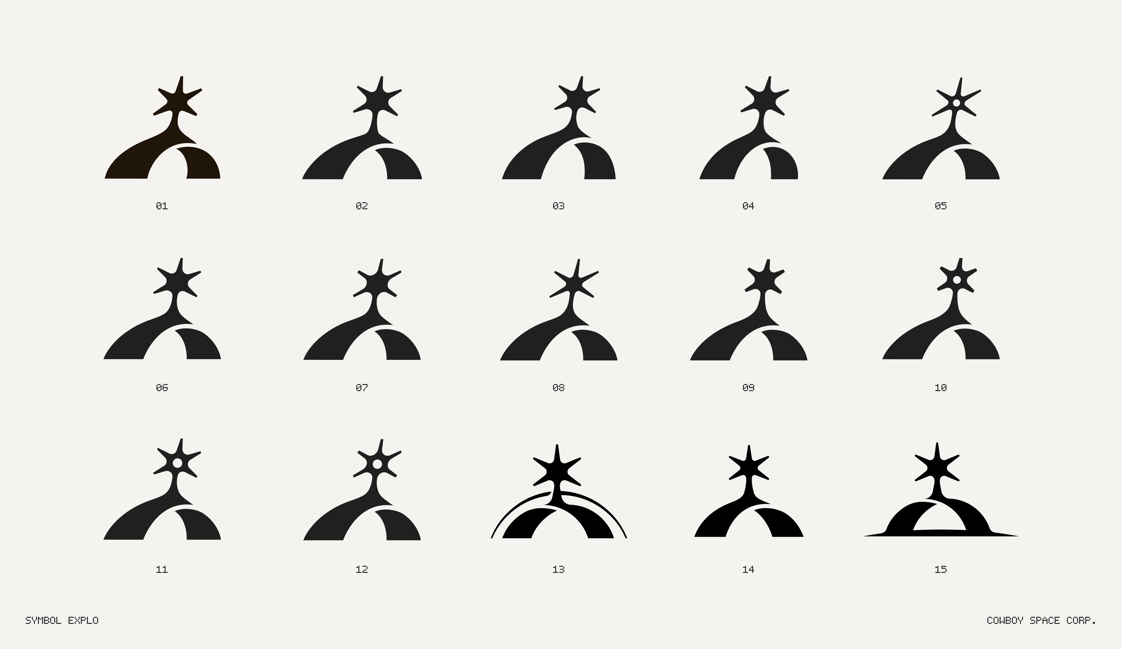
Simple, straightforward, yet strong with just a hint of concept that isn’t over the top. One of those if-you-see-it-you-get-it type of symbols. Tully Ryan probably made upwards of 20 different versions of this symbol. We tested all different kinds of spurs, different skews, grounding shadows. You name it, he tried it.
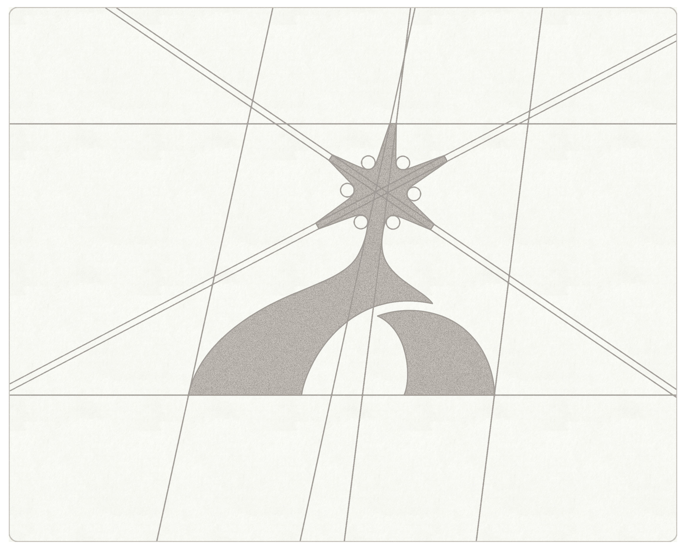
We landed on this one with a slight forward-leaning tilt to give it a bit of momentum and energy. I’ve been super attracted to non-symmetrical logos these days. Maybe I’m just swinging the pendulum away from the geometric butthole vibe that we got lumped into for some reason. Everything looks like a butthole if you want it to. Anyway…
Heard you liked type, so we put type on your type.
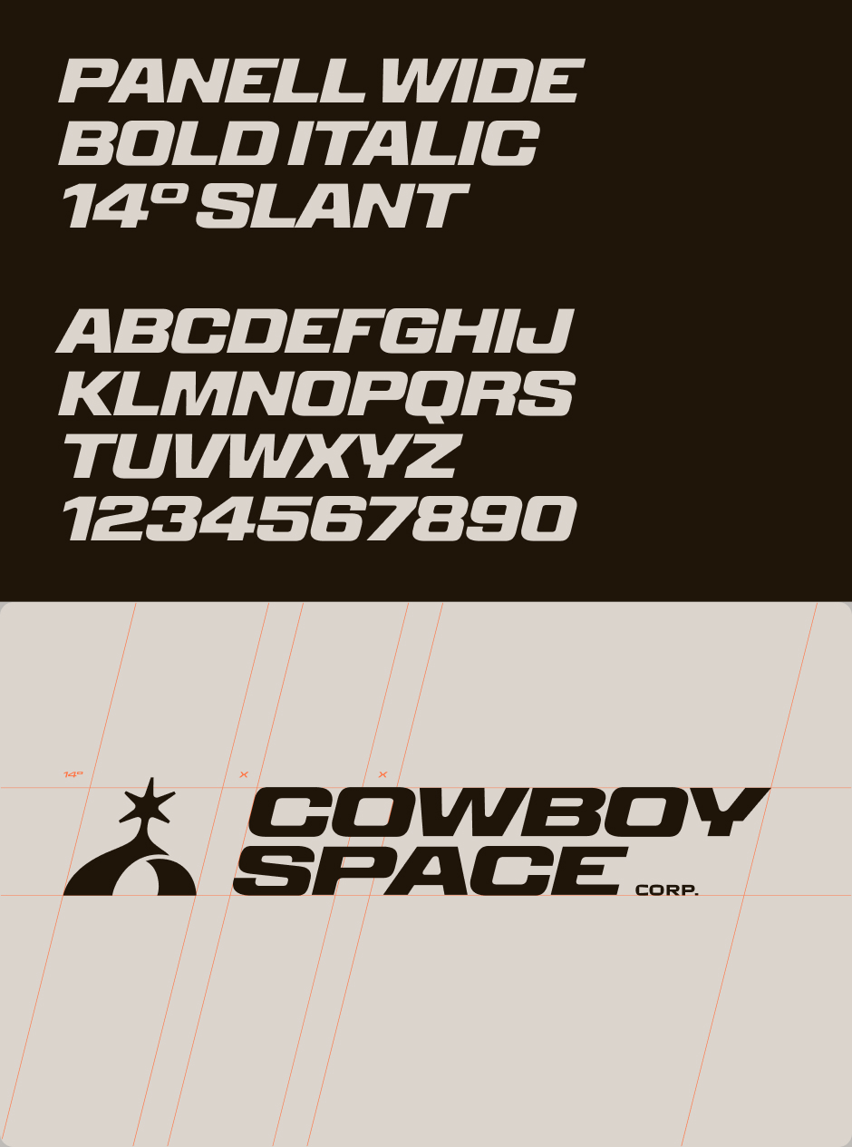
To balance the overt cowboy-ism of the symbol, we wanted the wordmark to lean more “Space Corp,” So we landed on the newly released Panell Expanded by Displaay. It has the perfect amount of strength, with a vintage aesthetic mixed with a few little moments of modern charm. The inktrapped lowercase A, for example, is on another level. Perfectly space-y.
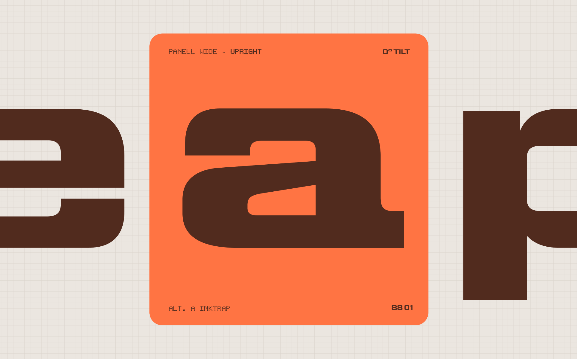
I love the solid squareness of the typeface—and when you set it in italic, it just feels like it’s full of potential energy. Ready to zoom off the page. Which was perfect to pair with our forward tilted logo.
A fun Easter egg is that we used the exterior of the O as a bounding box for a lot of supporting elements, including some very fun patches that are def going on a trucker hat at some point.
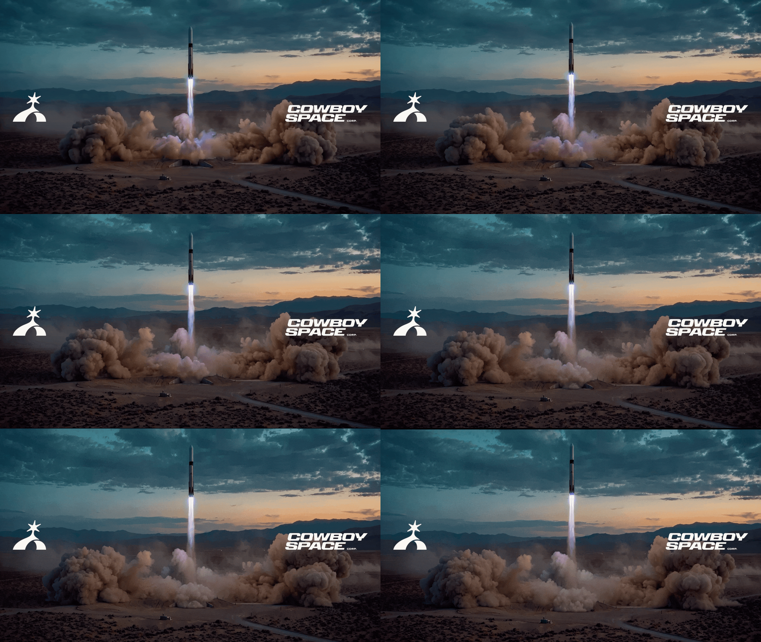
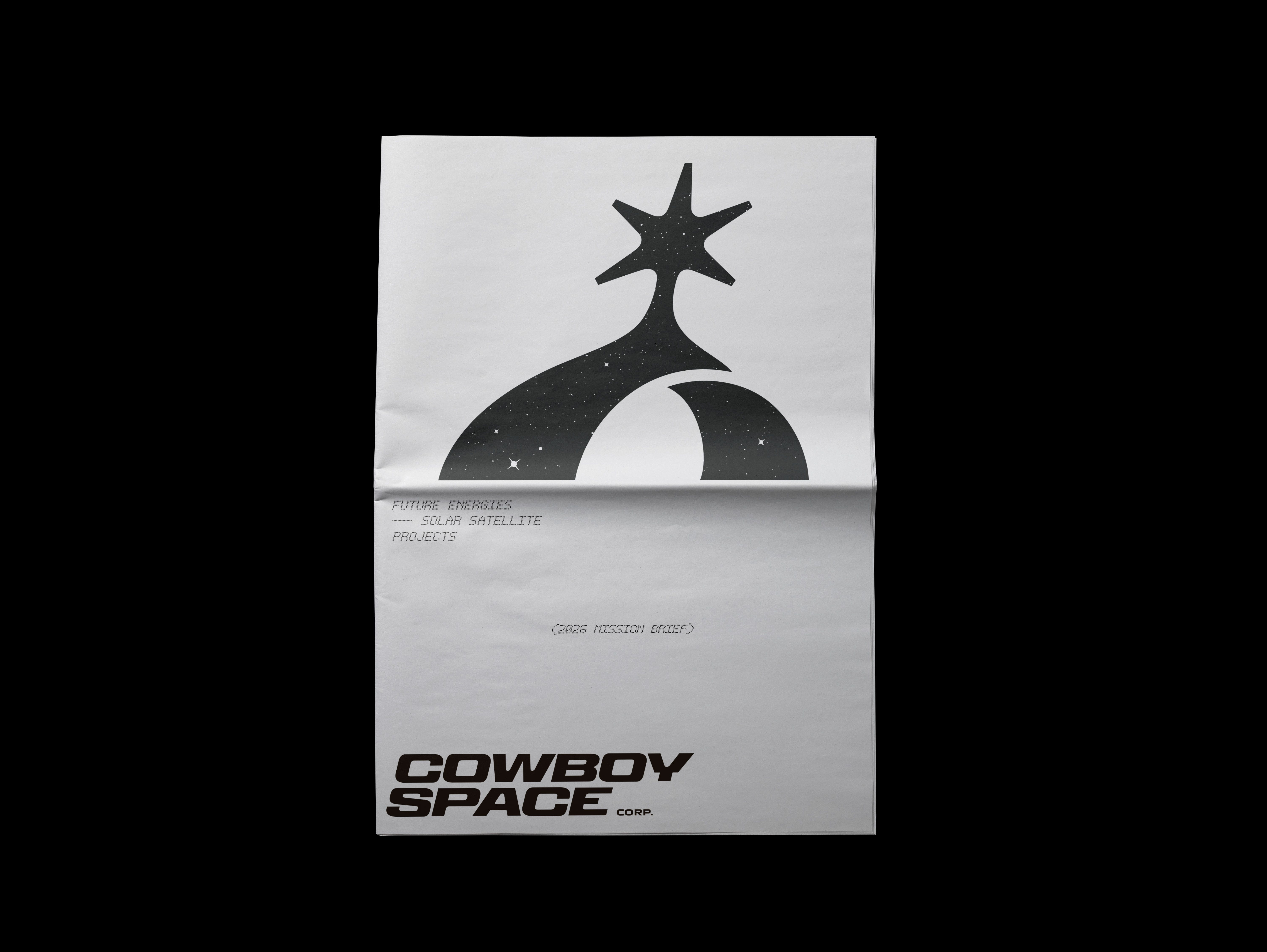
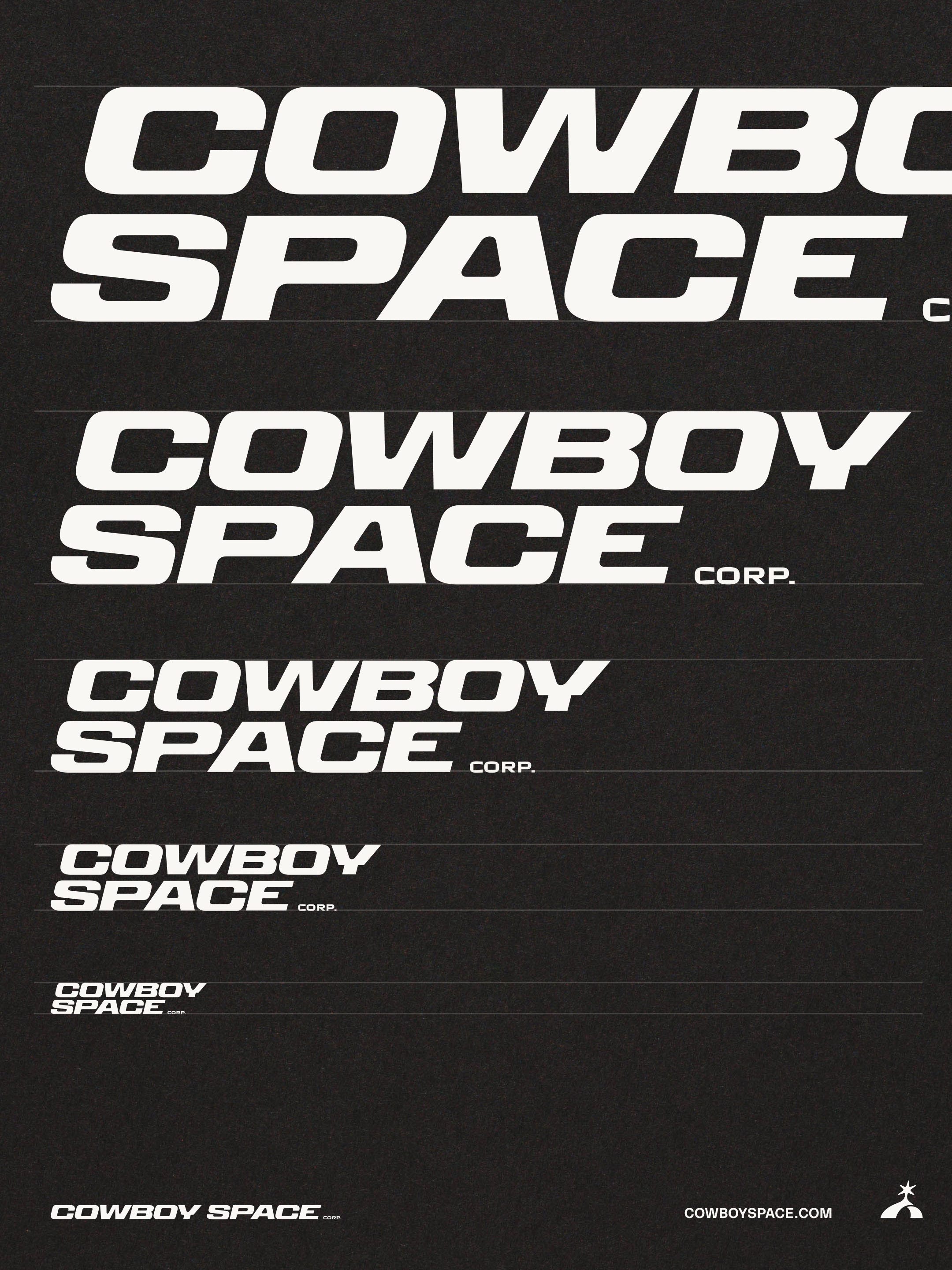
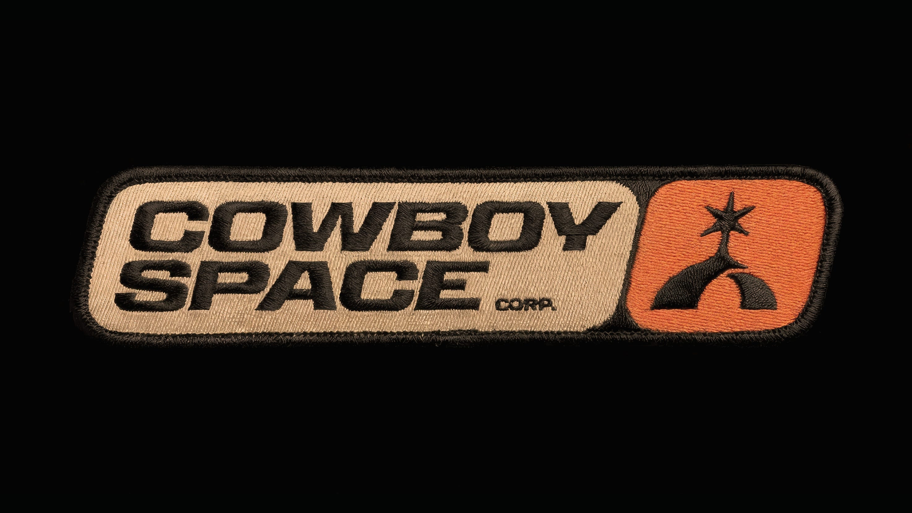
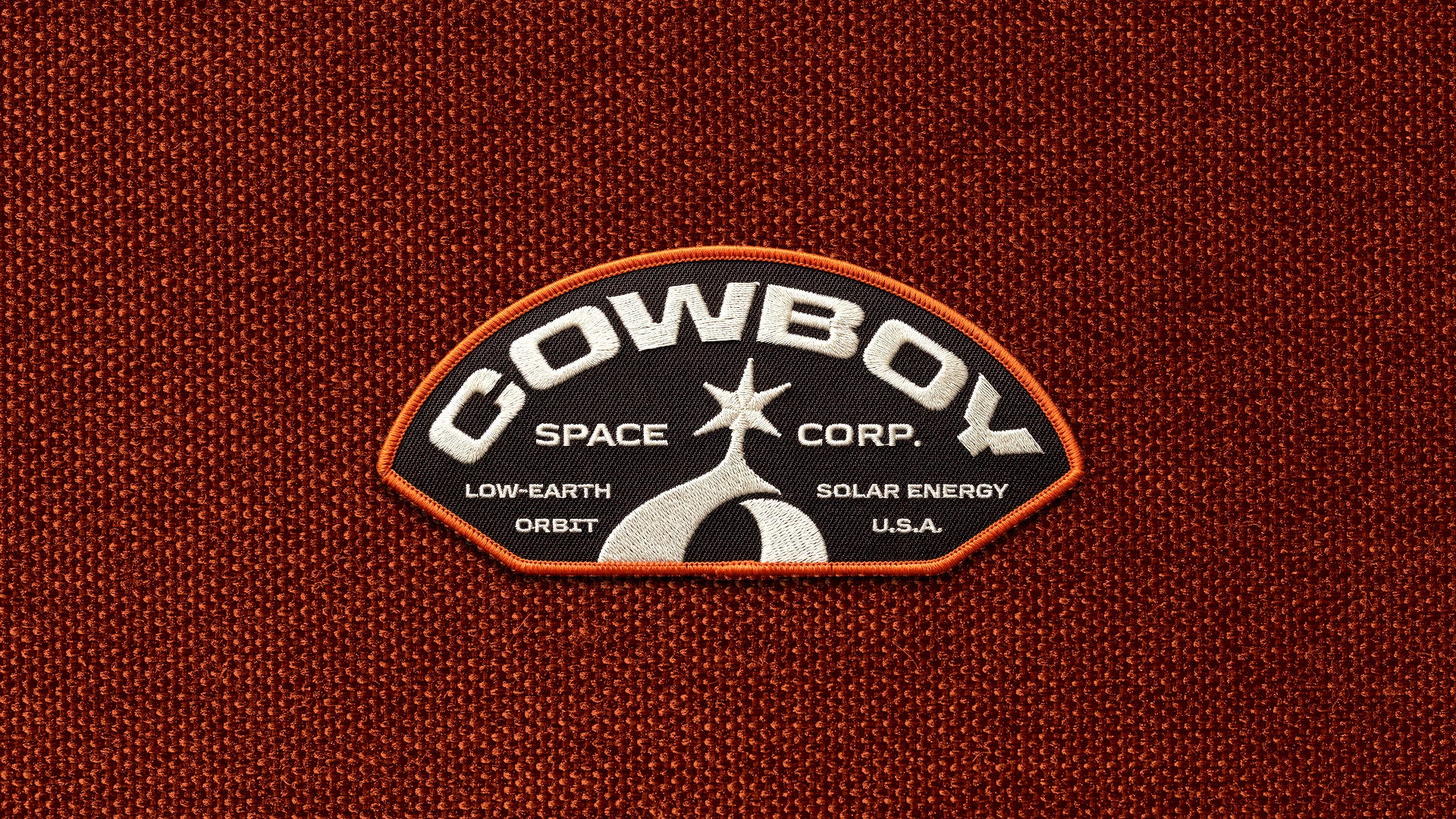
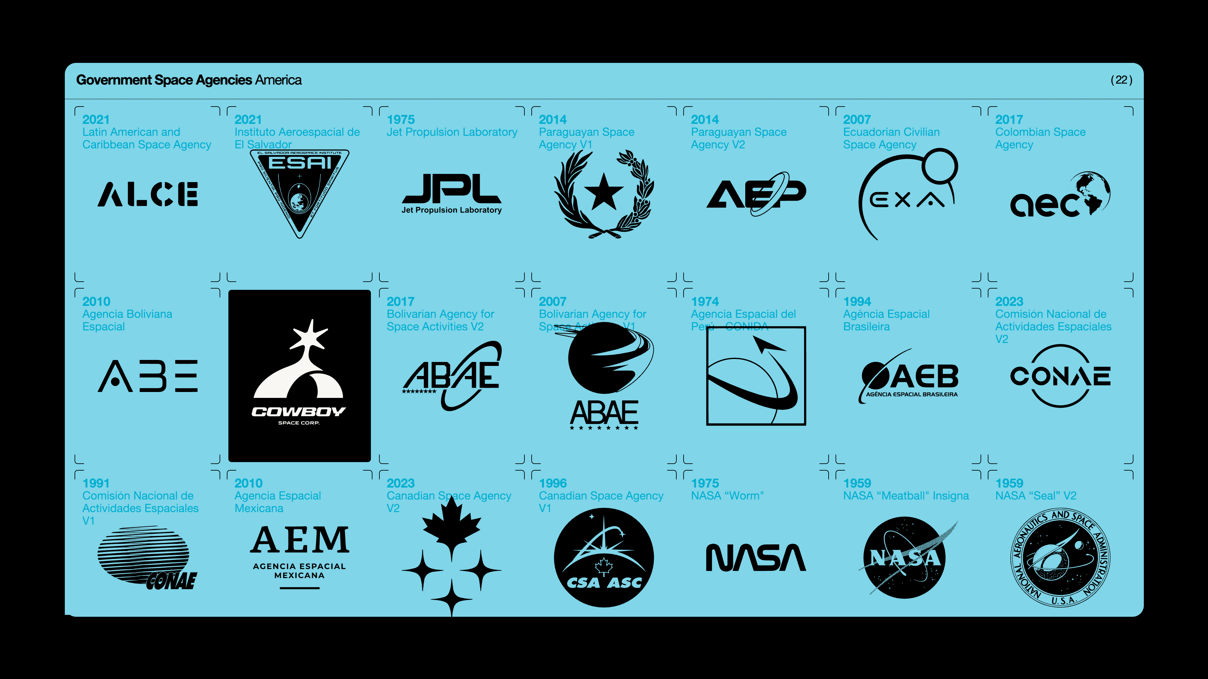
Altogether, the logo holds up nicely in the visual language landscape of typical space companies, without sticking out like a sore thumb or blending in too much. Lotsaaaaa circular orbit shapes out there.
It also scales down nicely for favicons and social media. We even made a special little patch mockup for the social media avatars. Nothing says space mission quite like a patch with an orange border.
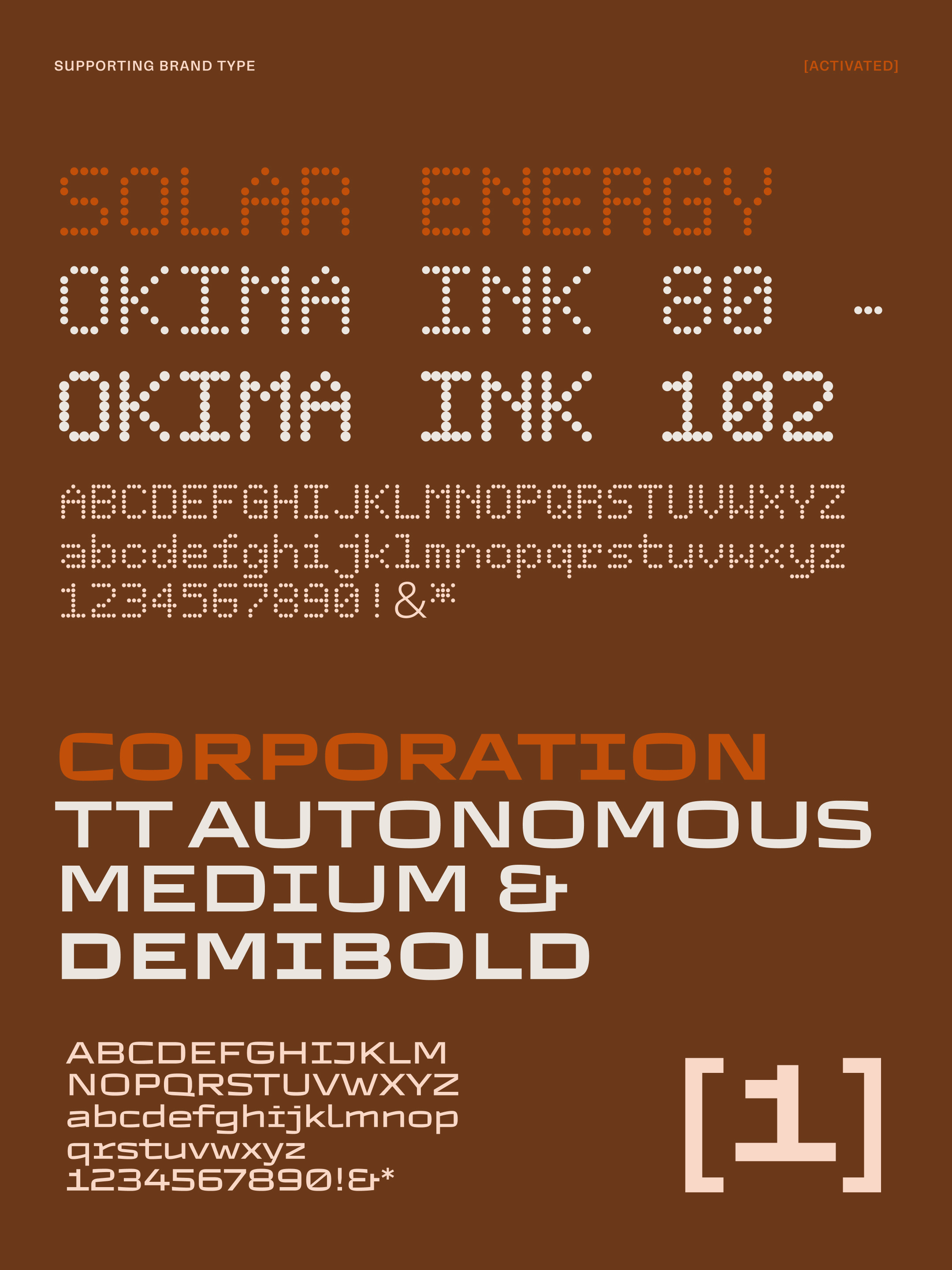
And because we’re insane, we didn’t stop there. We decided to pair Panell with FOUR other brand typefaces. Completely responsible and practical thing to do. But when you’re going to space you gotta look your best, you know?
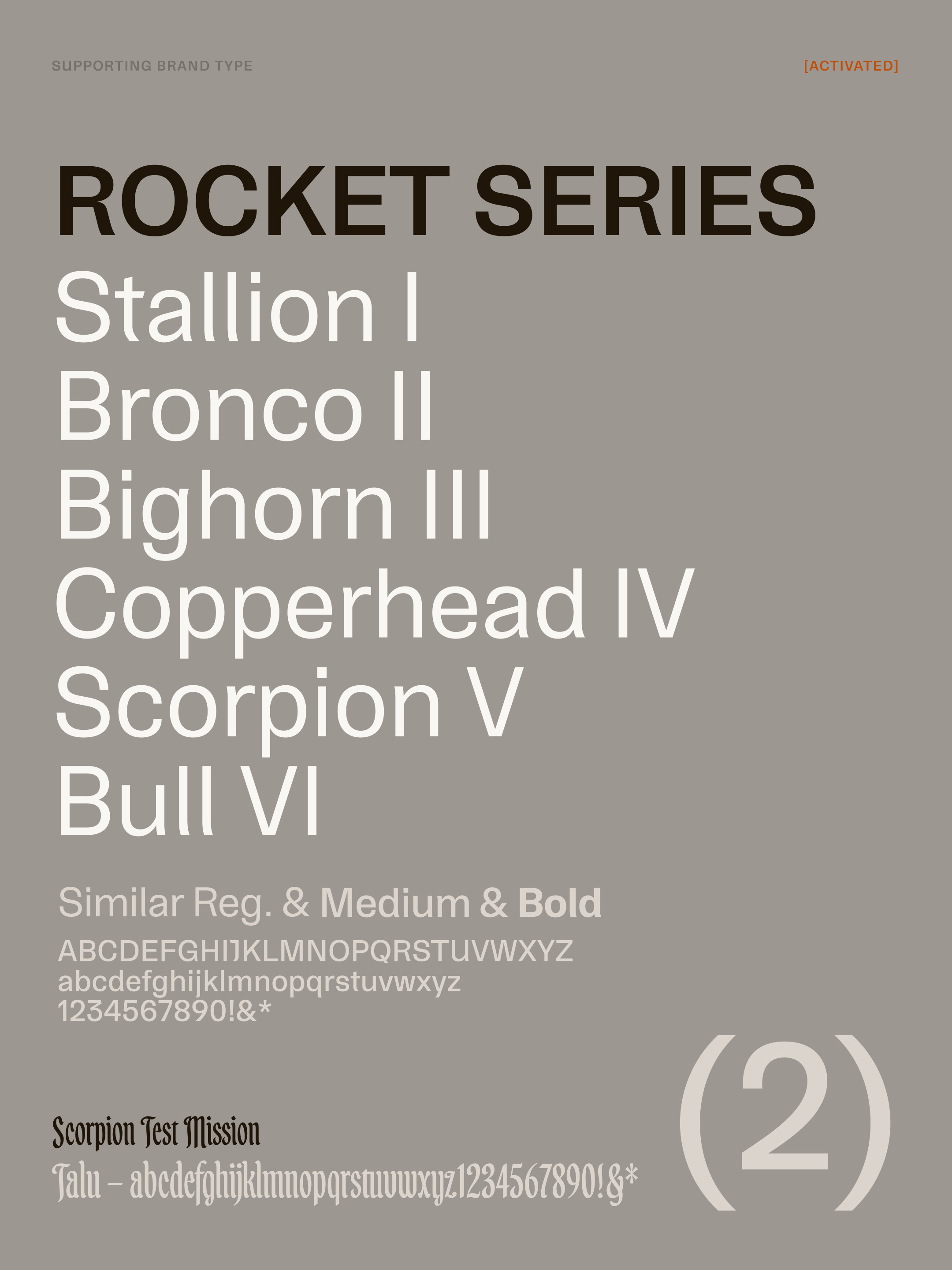
We chose Similar for body copy and brand support, Autonomous for the “Corp.” in the lockup, Okima for bitsy detail info, and Talu to bring a little bit of western whiskey into the mix.
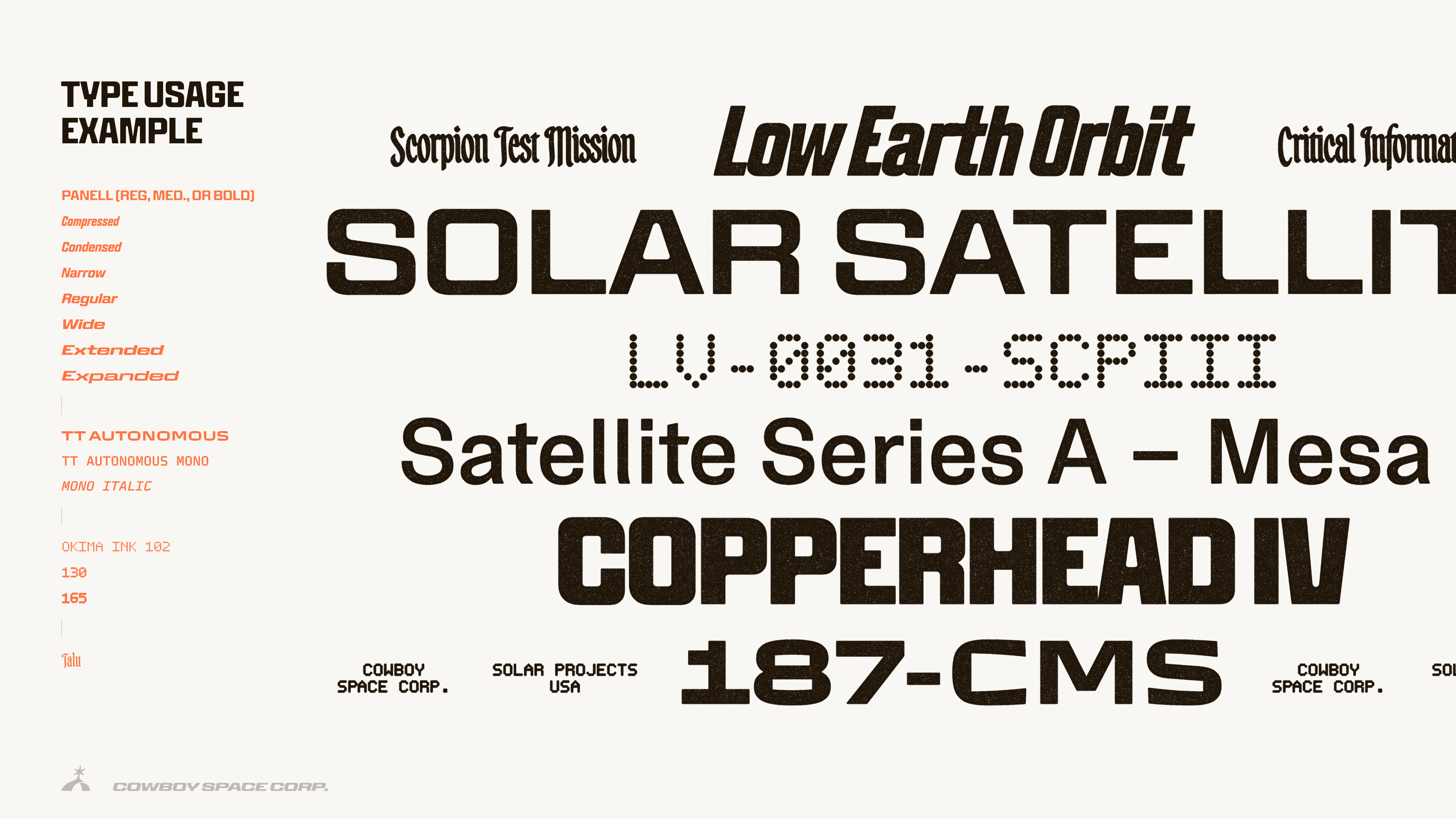
We really loved Similar as the main supporting brand font because it’s almost a classic no-nonsense grotesk like Helvetica, but they’ve incorporated just a few little kicks in the lowercase verticals that bring it into a somewhat technical feeling. Perfect for the space vernacular. Not distractingly technical, just a little bit of love.
(Disclaimer: Names below are fictitious for type testing only.)
Color: Rocket fire and dust
Defining a color palette for a space brand is always tricky. Your brain pulls you to black, white, and blue almost immediately. International orange/red if you’re a NASA fan.
But if you listen to your heart, you’ll find that there’s a lot of soul in space, despite there being no oxygen and immediate death in the darkness and confirmed aliens. It takes a hell of a lot of passion and dedication to strap yourself (or anything really) to a rocket and launch it into the abyss. We wanted to capture that passion with this palette.
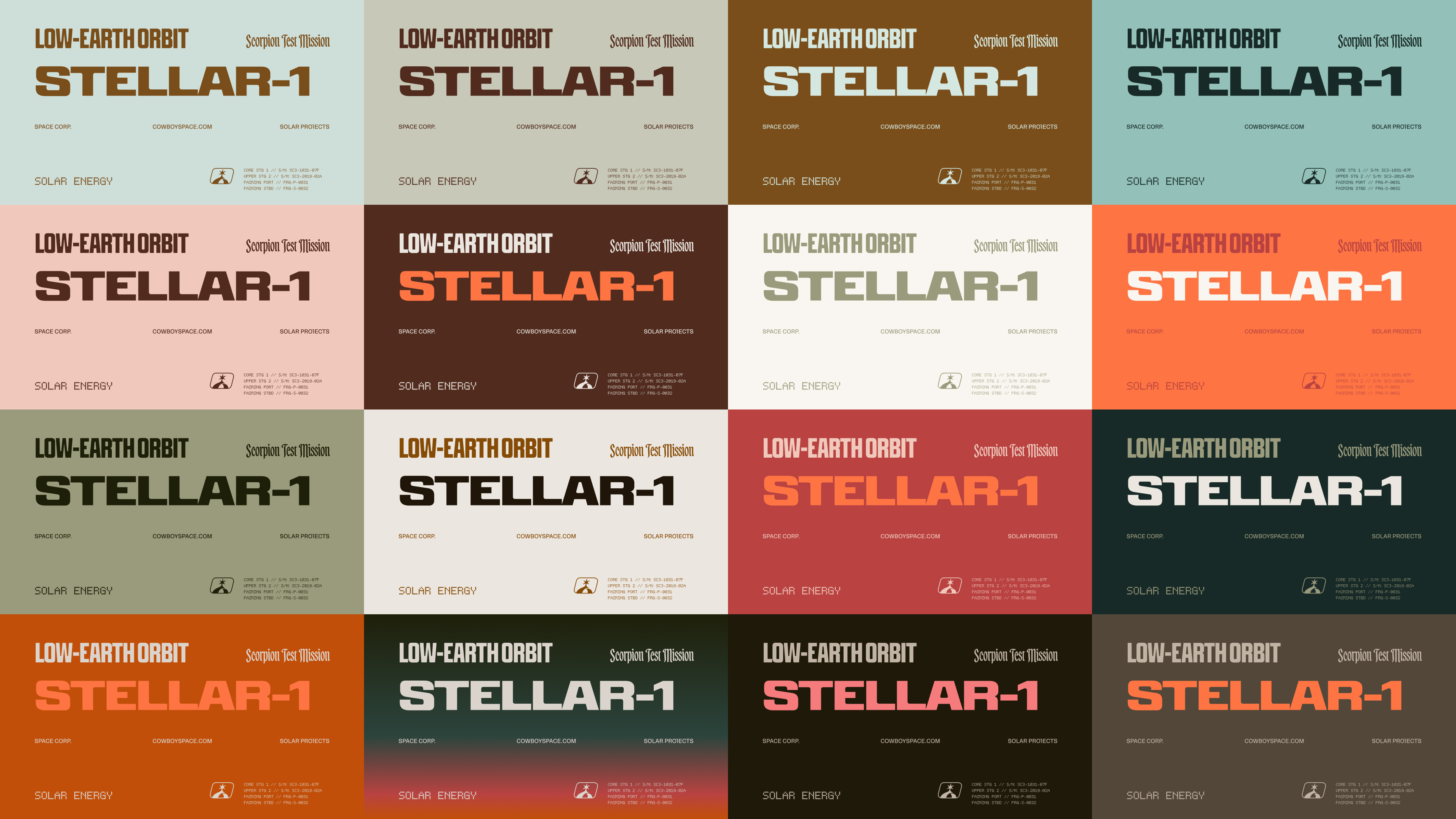
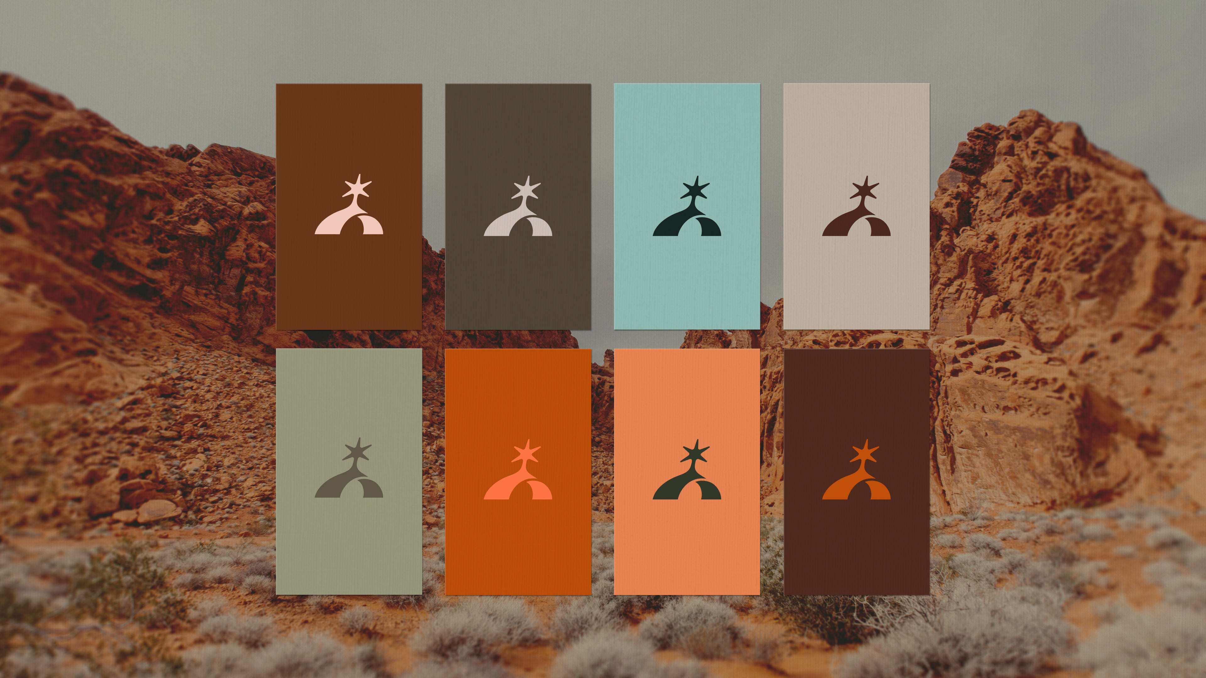
We wanted the color palette to nod to the Cowboy name with a western, warm feel. But we also wanted it to have some pops of unexpected unnatural moments—colors that could bring the vibes back up into space, not just some old piece of equipment left to rust in the desert.
We always love to go hard with probably too many brand tones and combinations for the full brand palette. But the core colors are actually very restrained, relying on dusty blacks, burnt oranges, and warm creams. But how fun are some of these secondary combos?
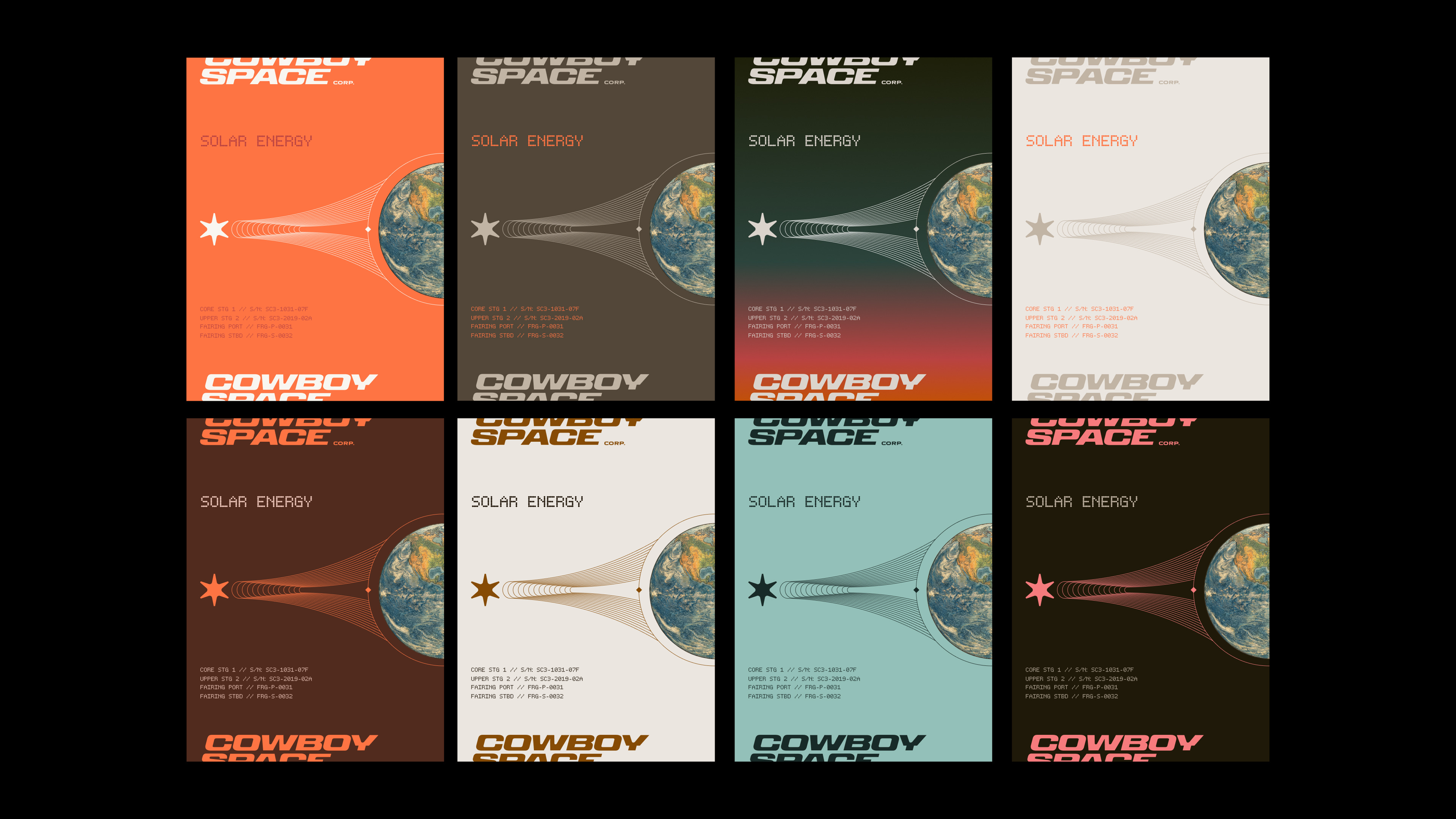
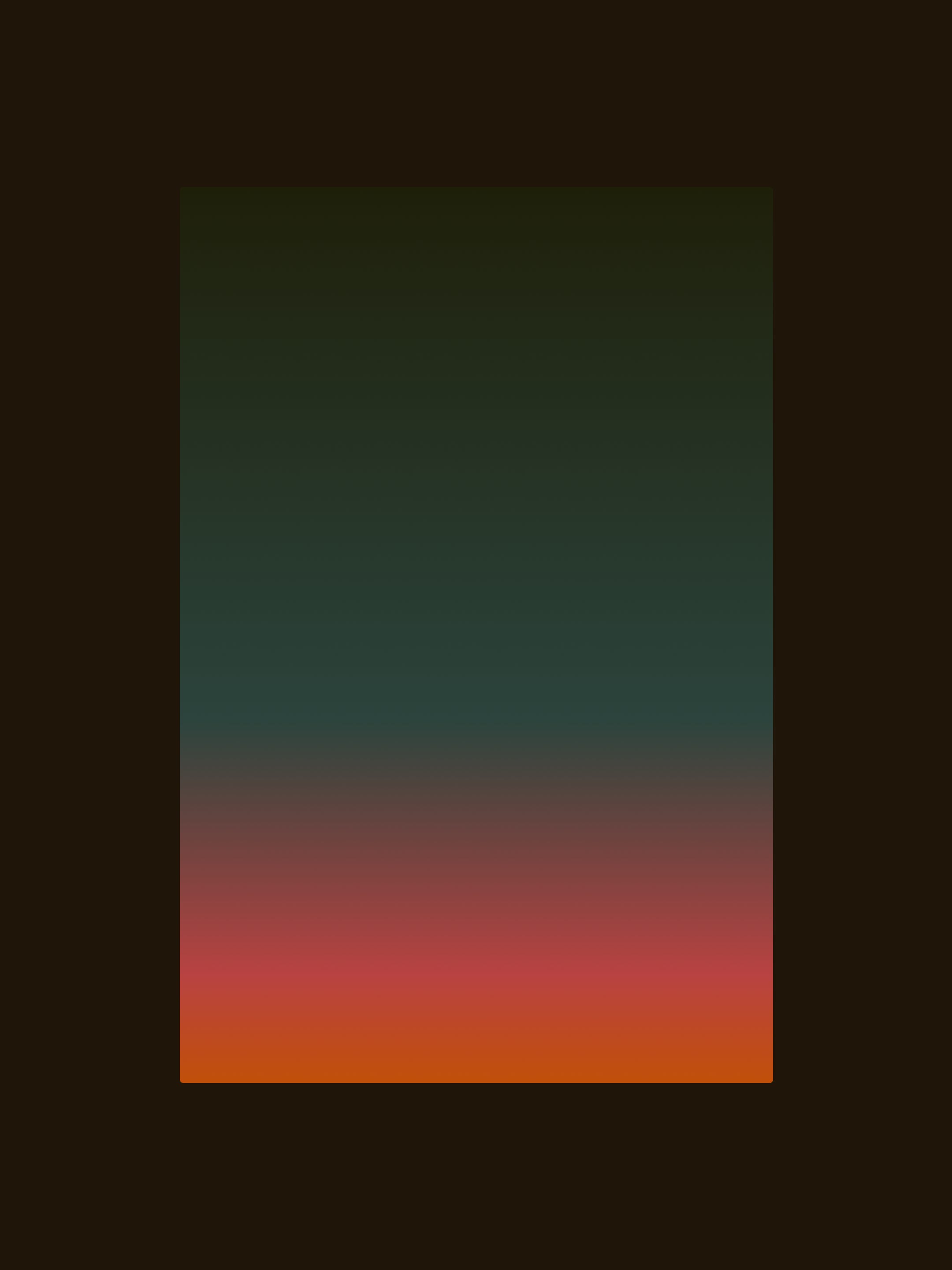
Honestly, this palette is one of my favorite color combos I’ve ever stumbled upon. There’s so much nuance and fun to be had within these combos. We even mixed in some unexpected gradients that feel like something you’d see out in the alien-like vastness of Canyonlands or Joshua Tree—there’s such a magic and aura to the sunsets and sunrises in those places.
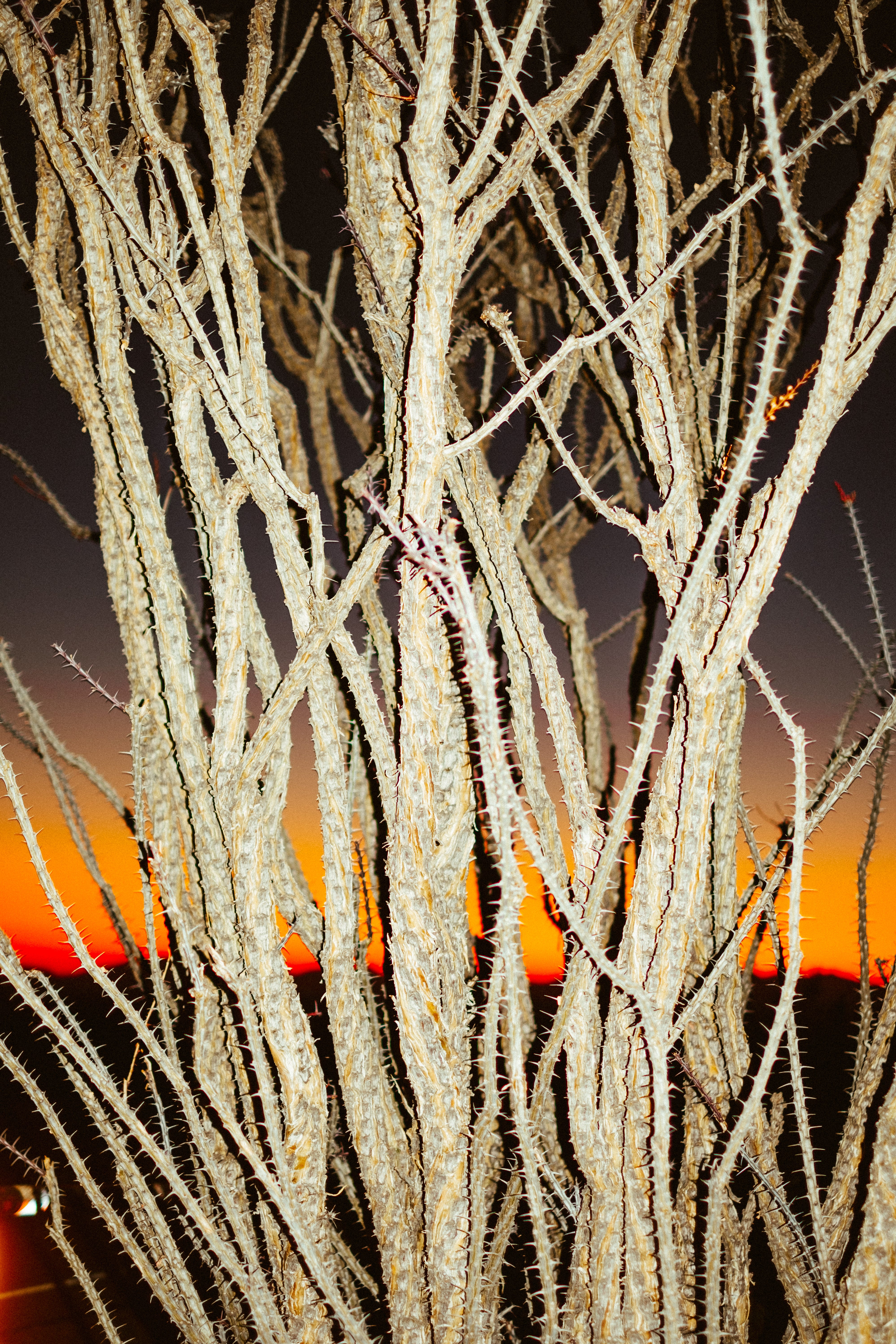
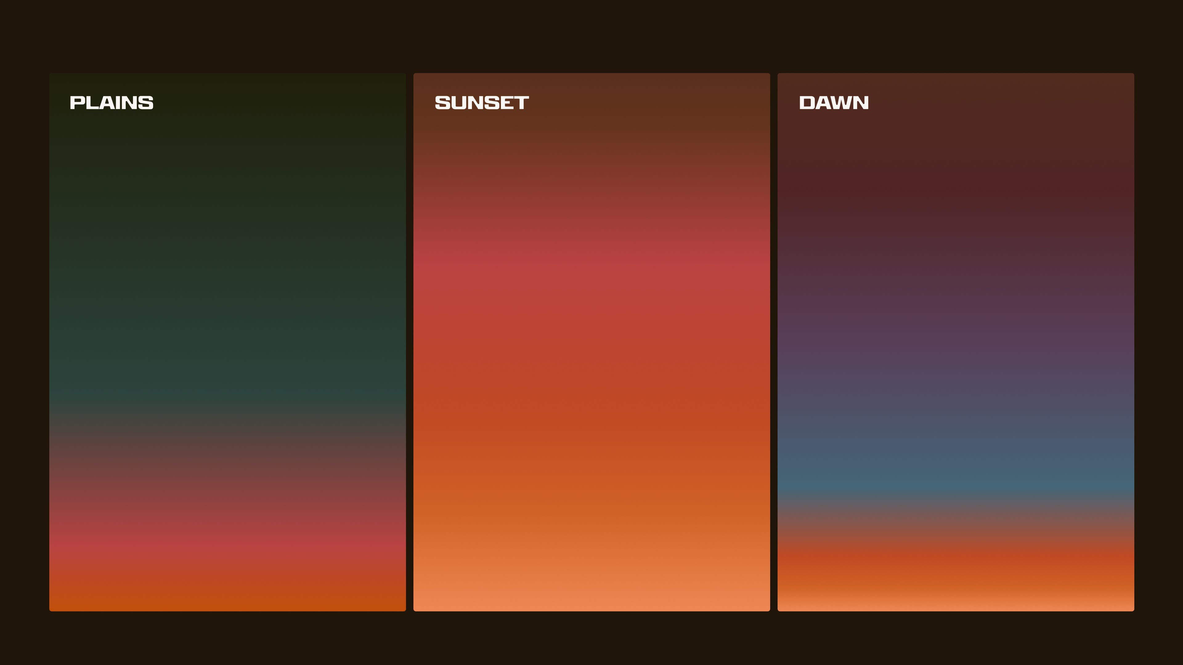
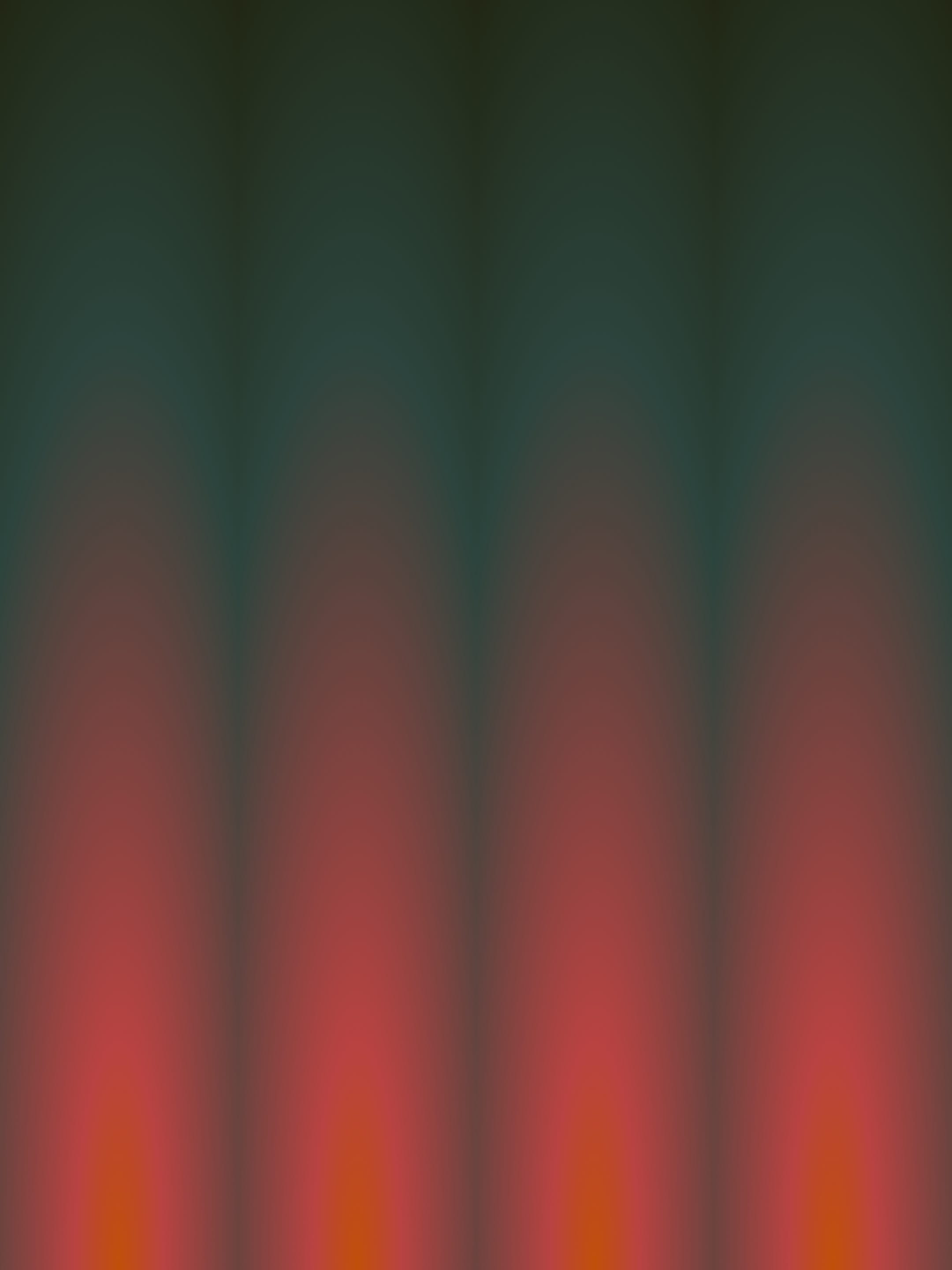
I did my best to capture some of the feelings I’ve felt when I was there. And the fun thing about this “plains gradient” is when you stick a bunch of them together they look like a unique take on rocket exhaust.
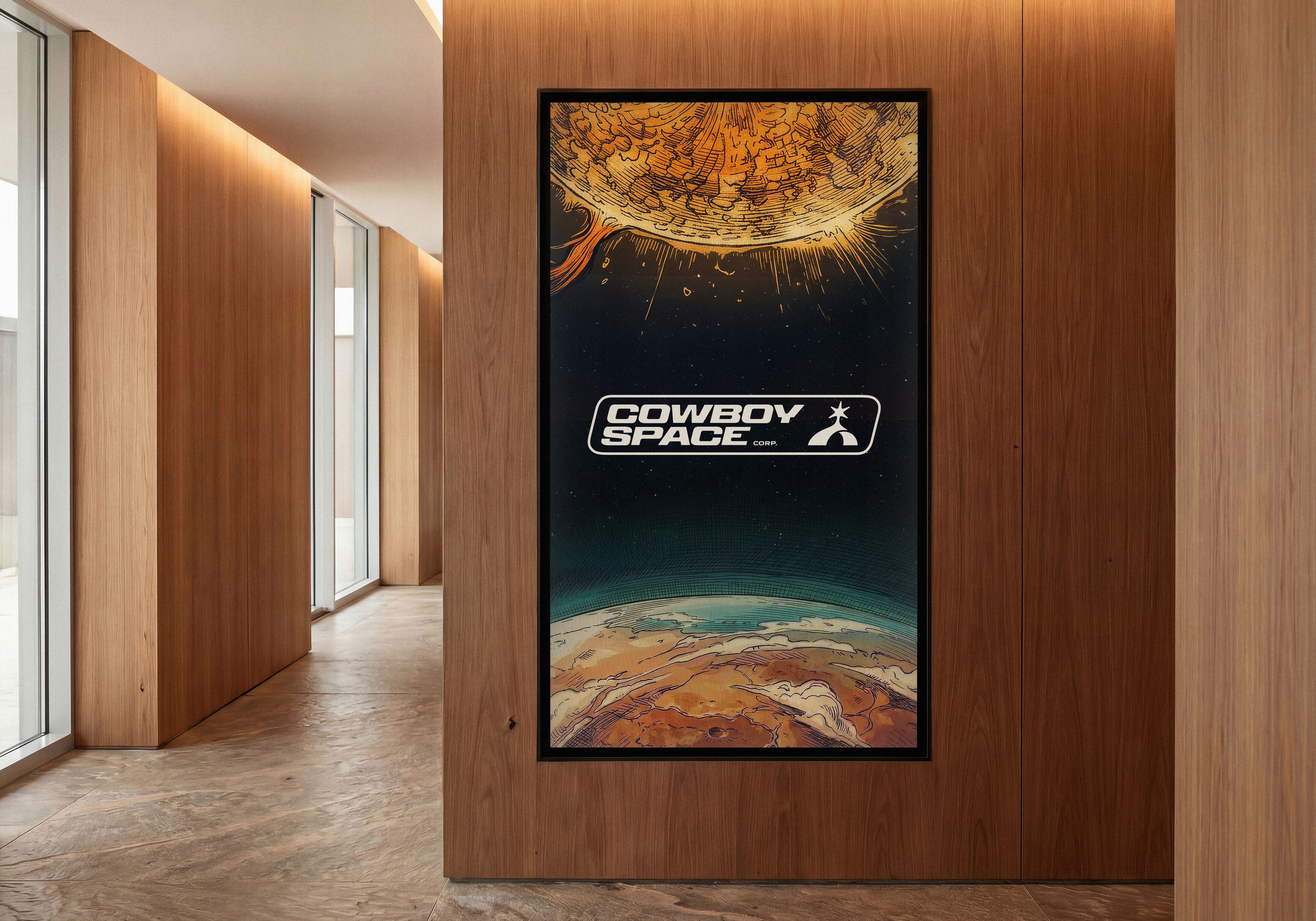
Charging the solar frontier.
Everything below this point was made specifically so you’d think this case study was cool. Not to say that all this won’t be real at some point, it’s just not real right now.
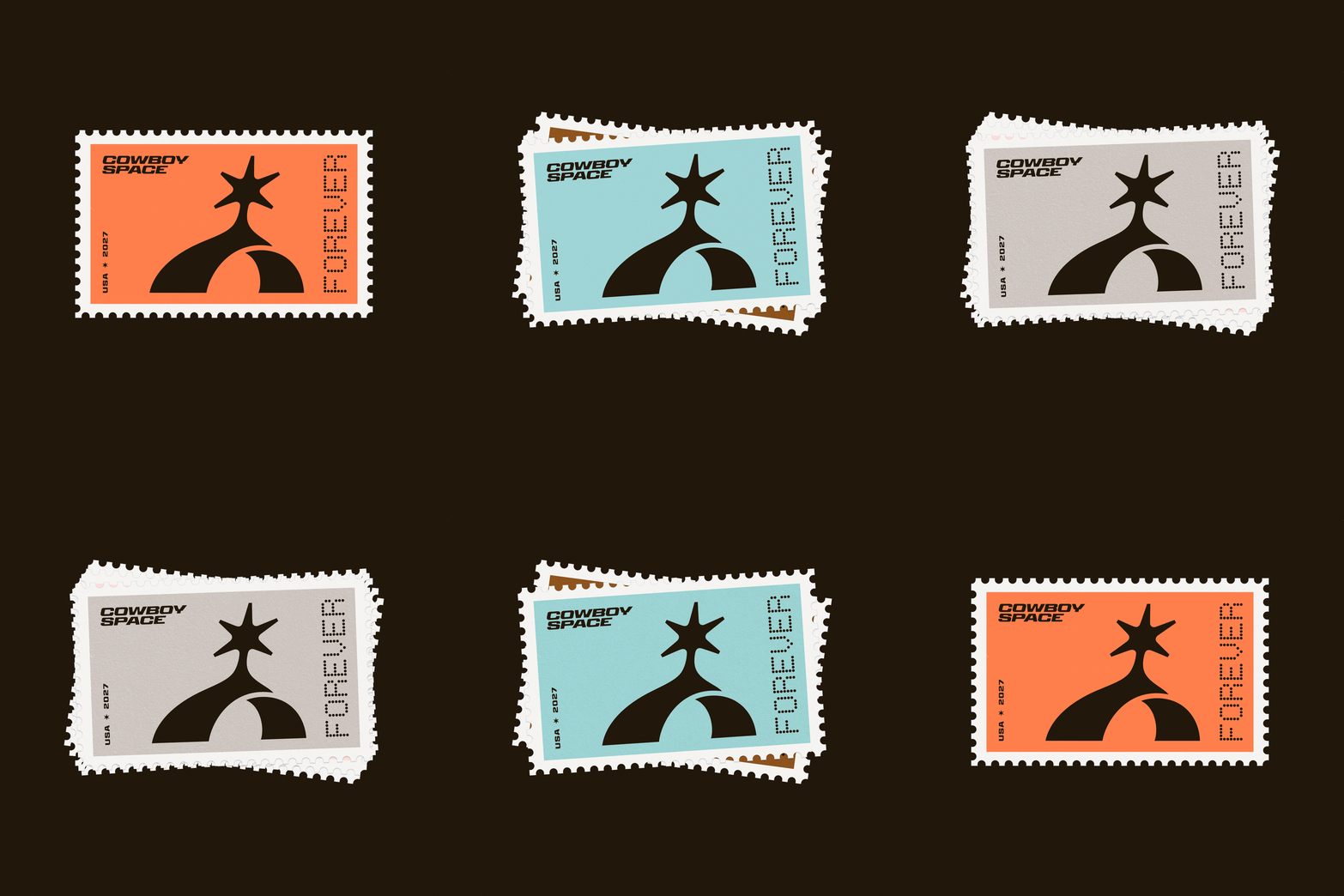
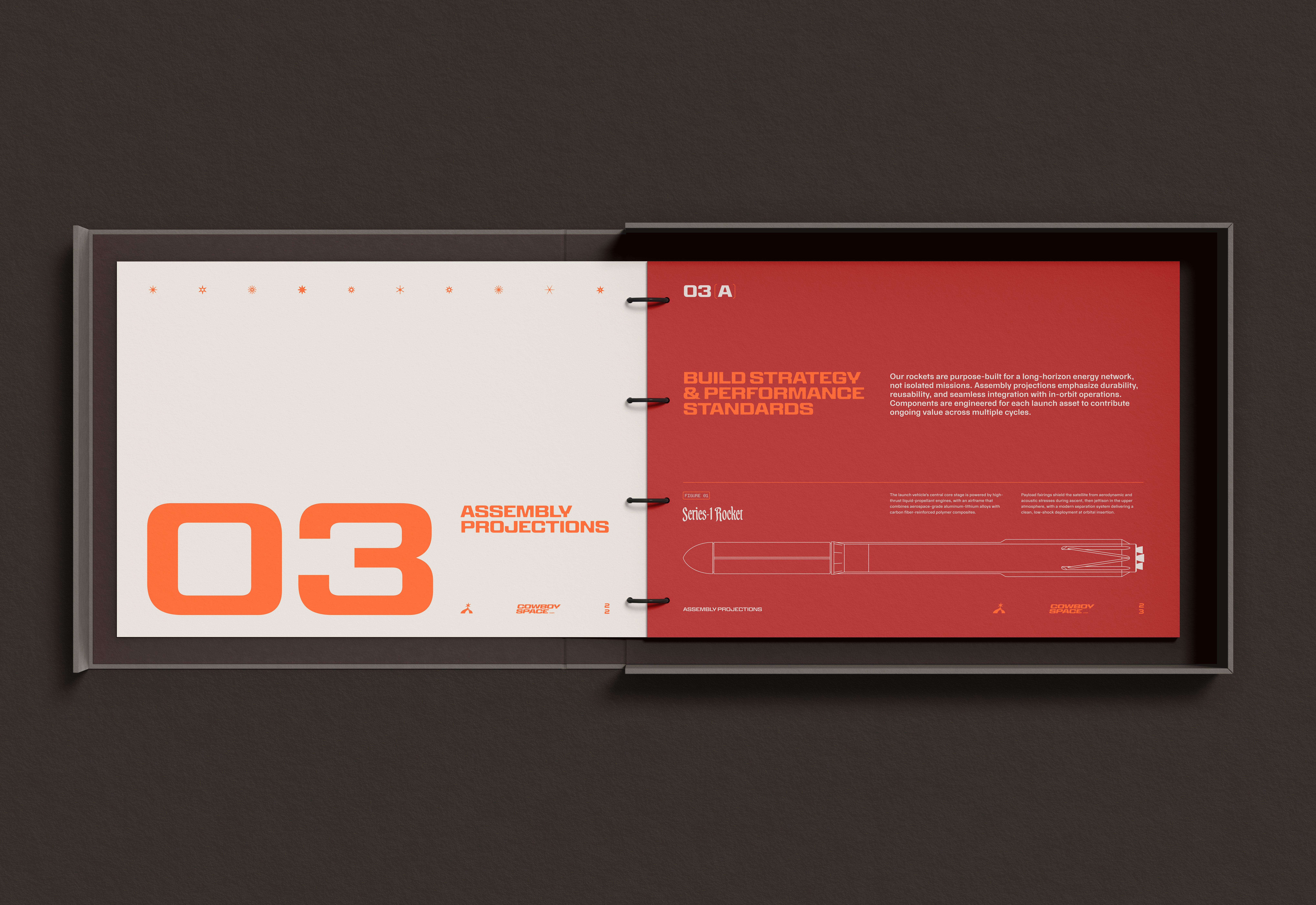
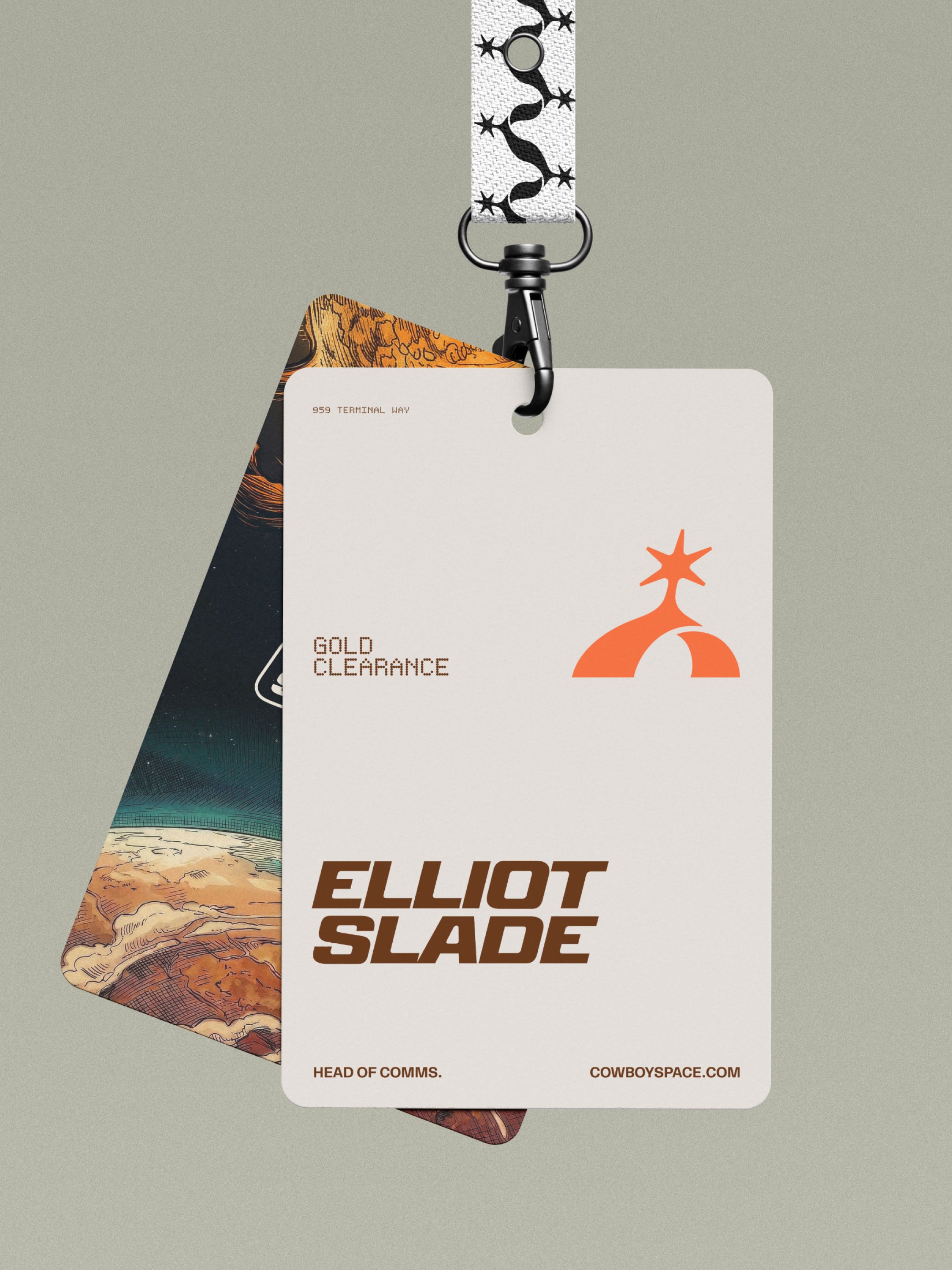
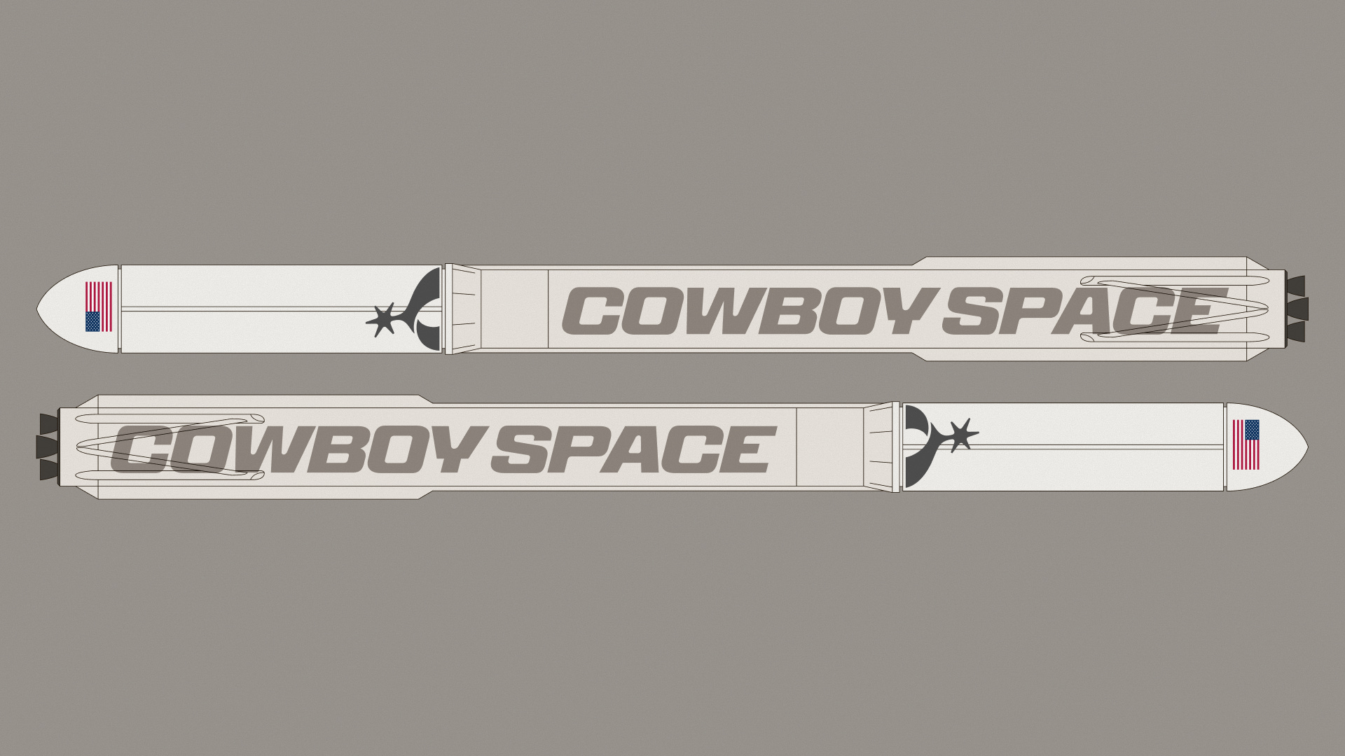
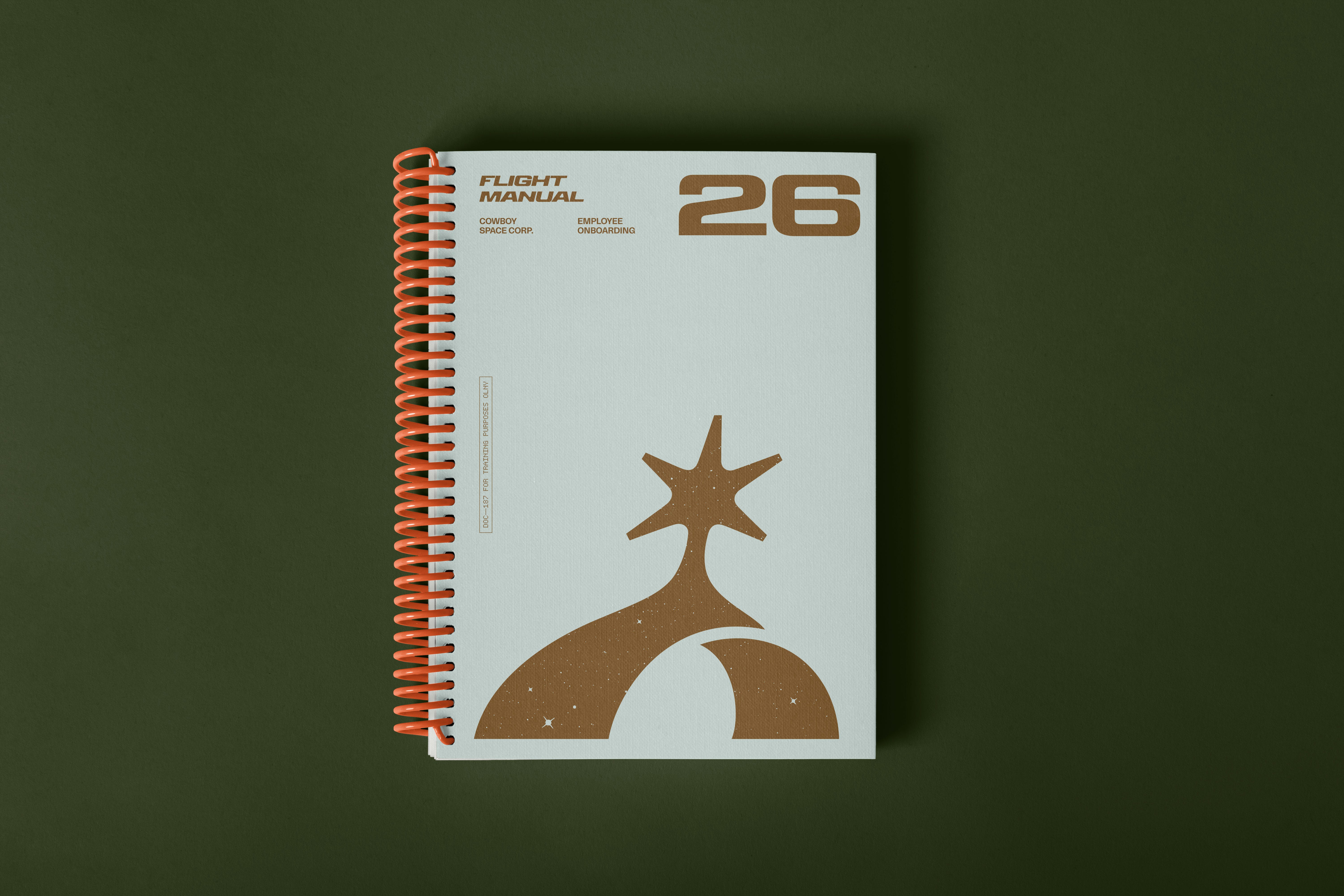
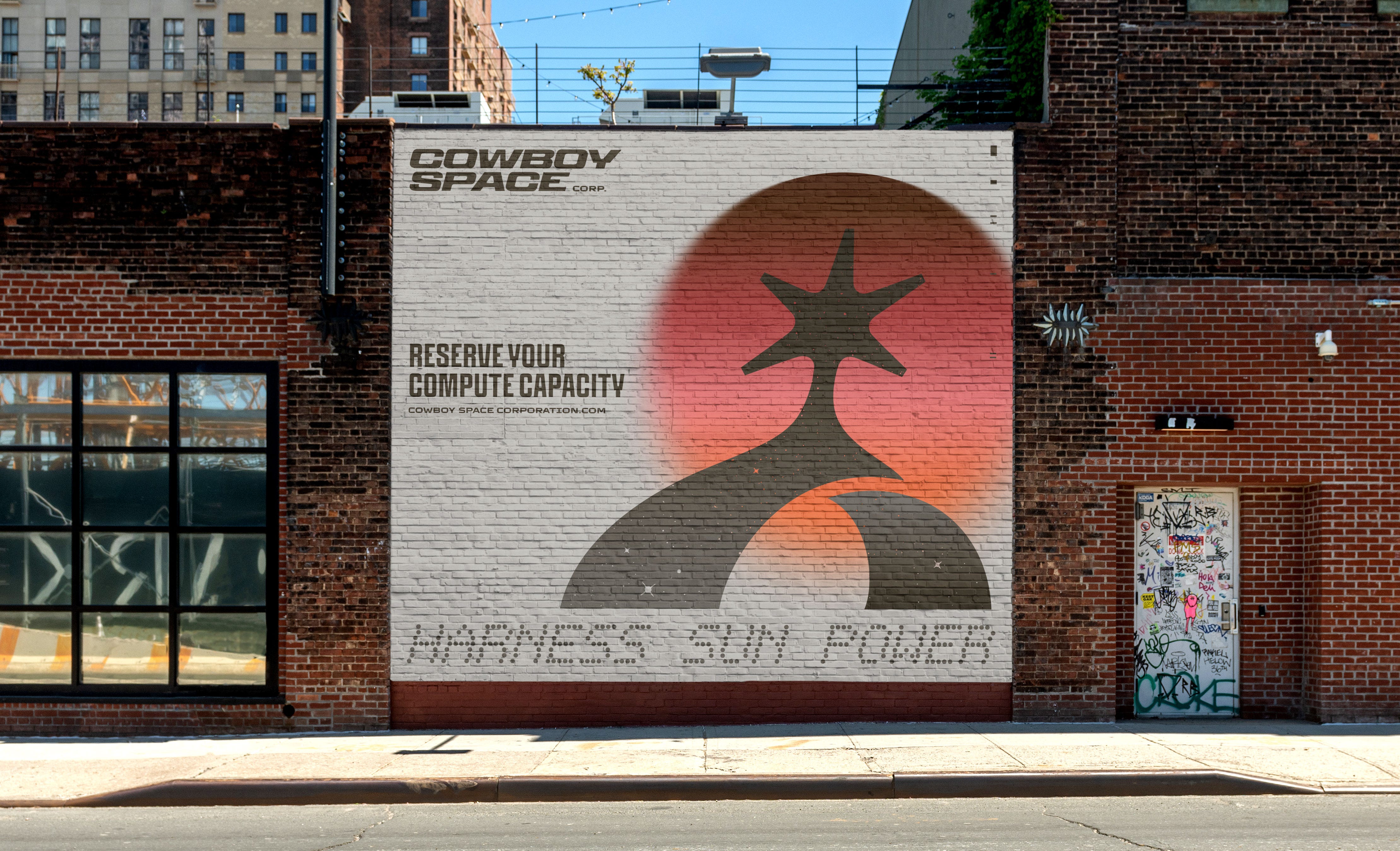
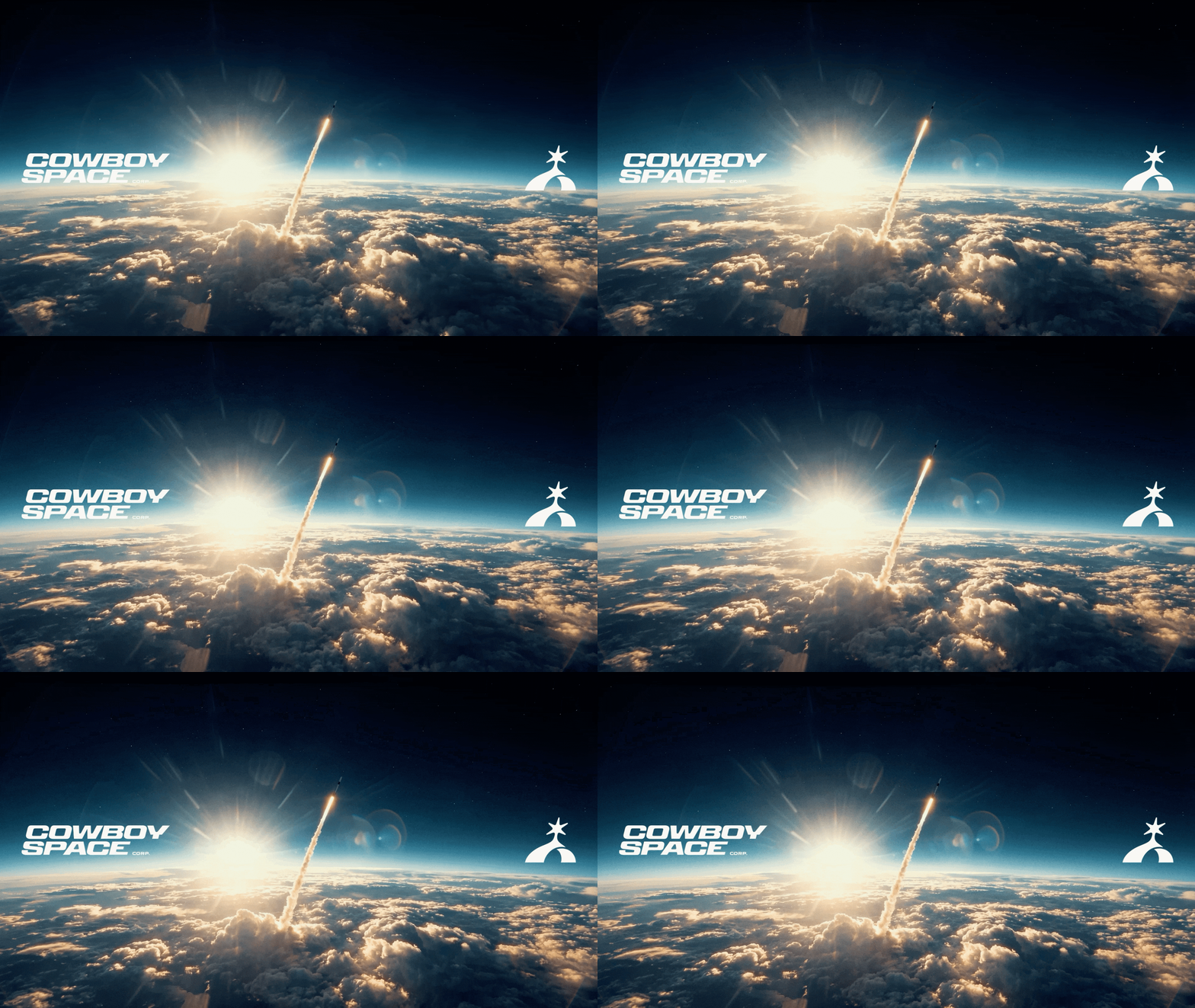
As I mentioned above, this was an extremely small scope just to get them an initial identity. But we couldn’t just hand over a nice logo and some wild colors. We needed to blow this thing out of the water. So here’s just a few glimpses into some of the brandwork pieces we made for this.
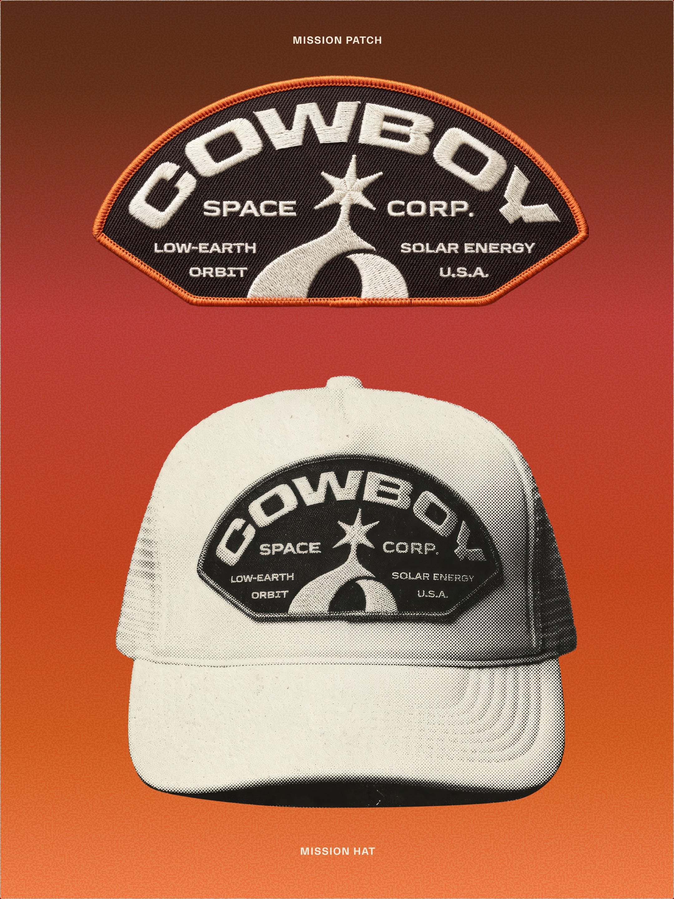
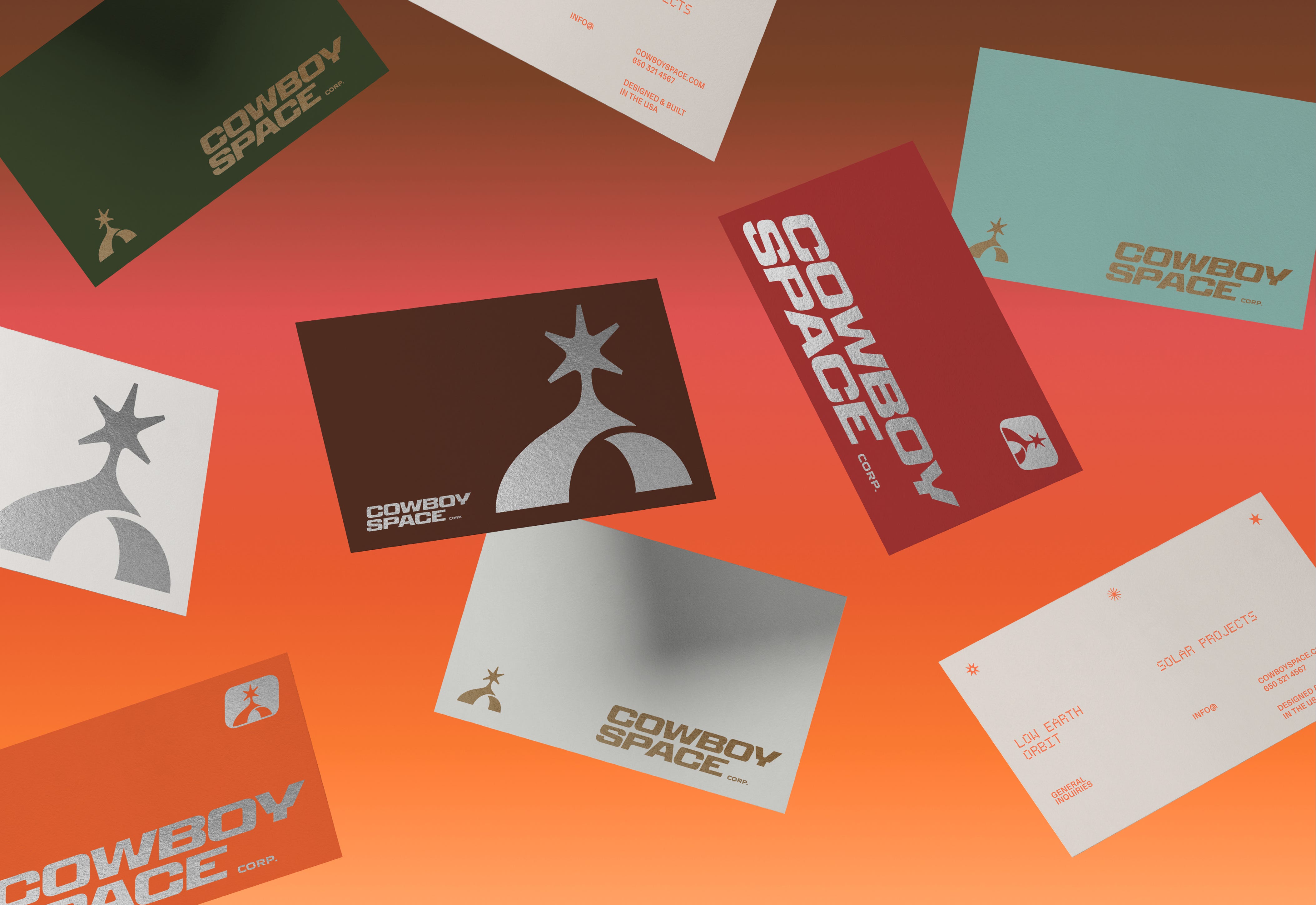
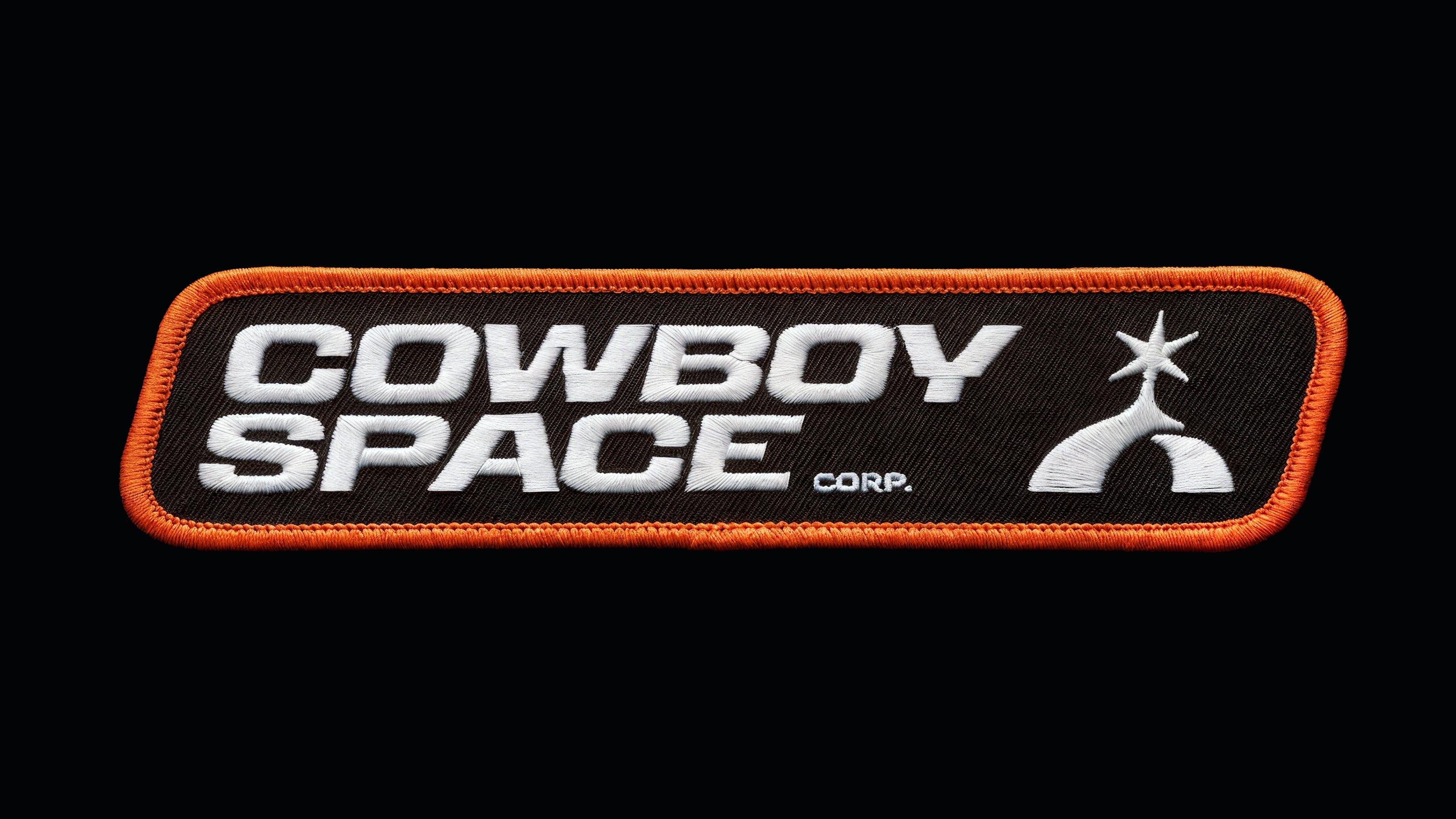
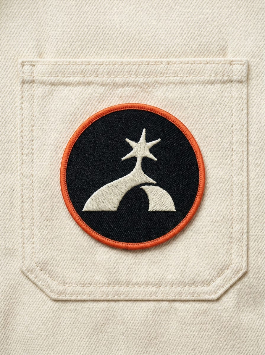
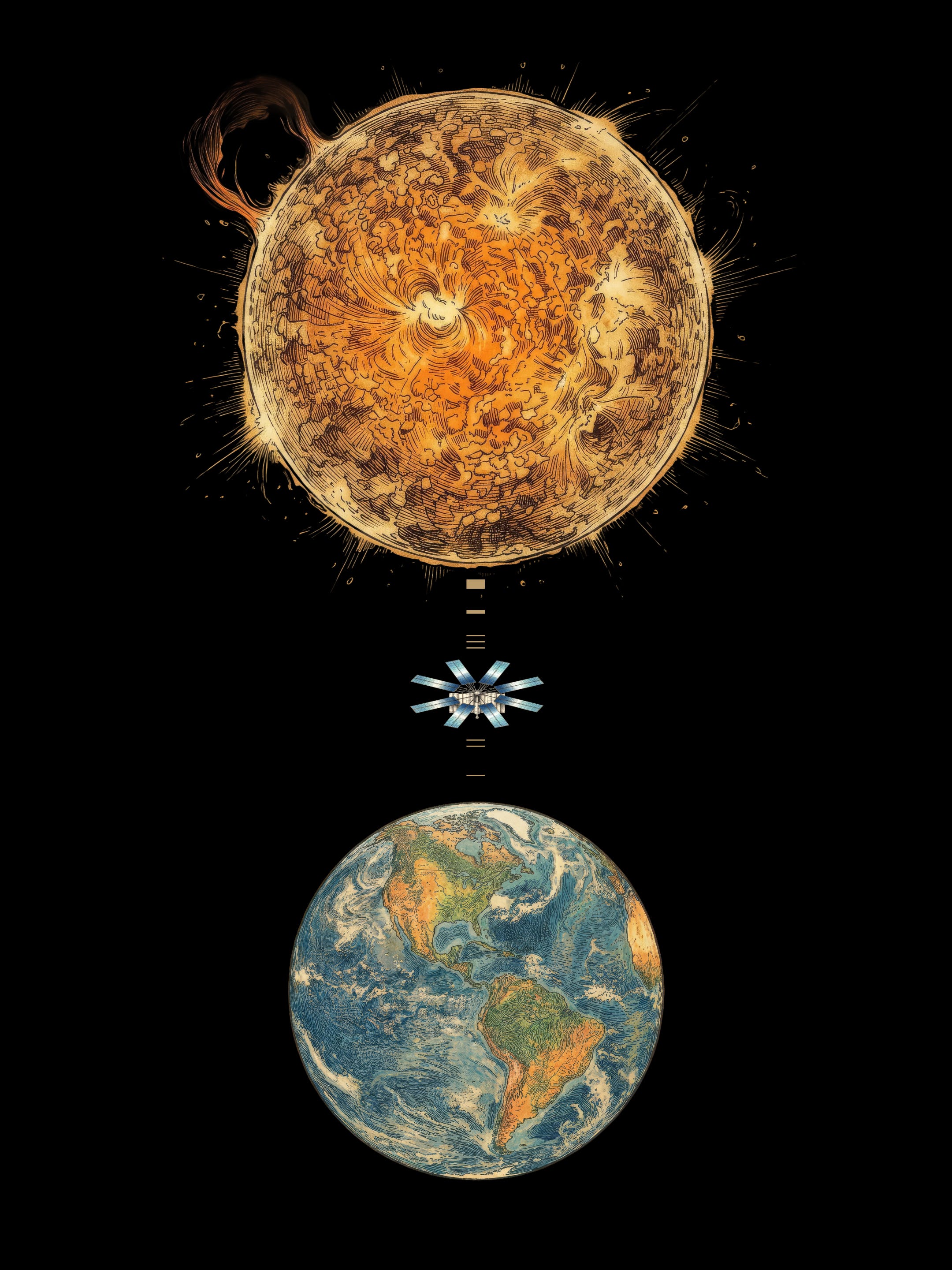
The Cowboy team had a moodboard of illustrations that they really liked, so we worked in Flora to develop an illustration style that they could apply to things like renderings of satellites, stock photos of planets, landscapes, etc. We found out Flora is also incredible at making pins and patches FYI.
Sidenote: I’m actively looking for an illustrator that can draw in this style so we can get some higher fidelity assets, but since this launch was a quick one, we just rolled with these as a solid placeholder for now. If you or anyone you know draws like this, please hit me up.
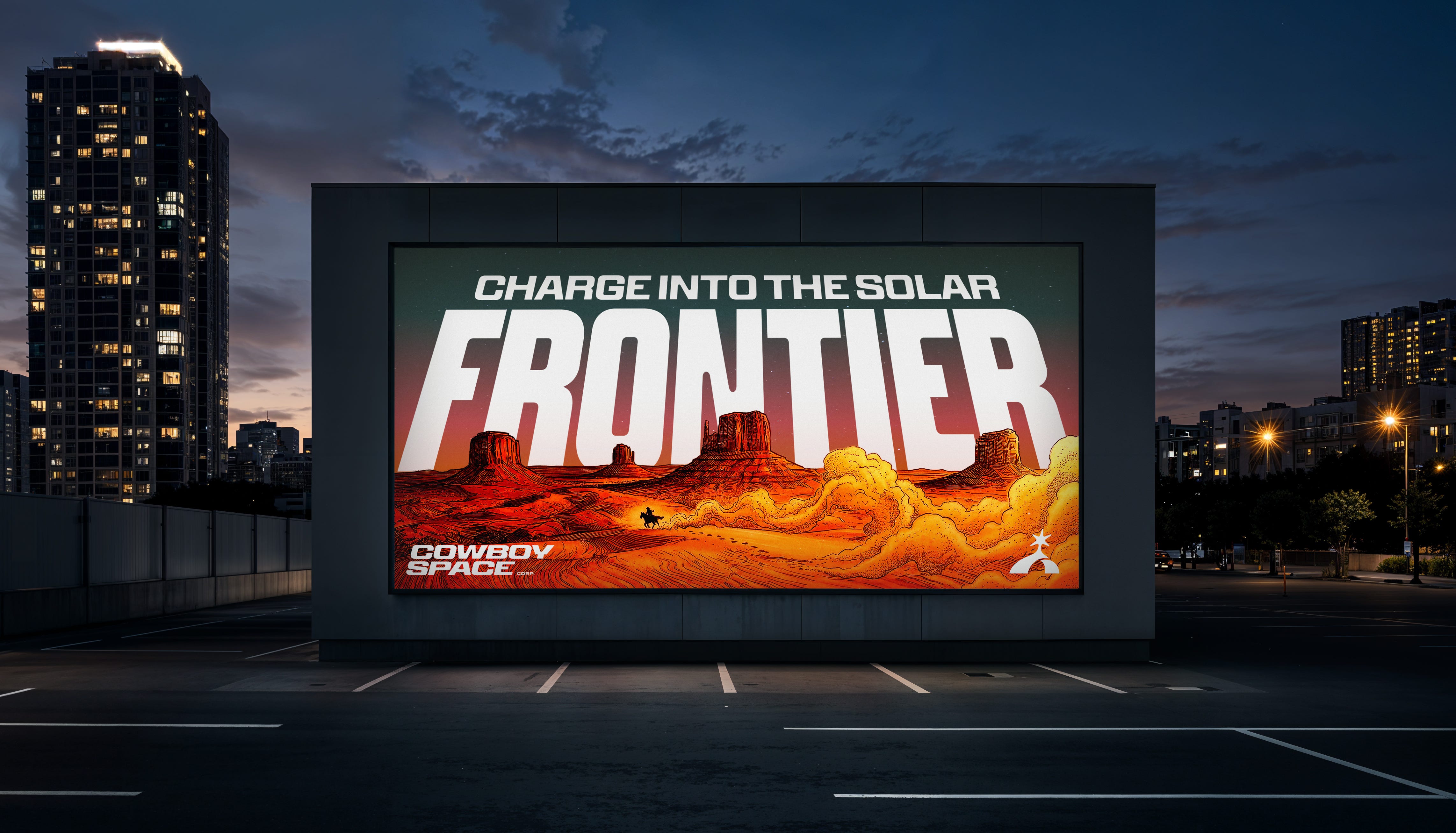
Maybe we’ve got more than one space-obsessed designer here at Smith & Diction, but this felt like an absolute dream project. One of those ones you keep not quite believing will actually work out—until it does. And then you get to put something super new and exciting out into the world.
This project came in as a cold email lead from Daniel Haire and I couldn’t be more grateful for his trust in us and guidance throughout this project. This project was a perfect example of when you put yourself out there, you never know who’s looking, and you never know what might just drop into your inbox. So keep making stuff you like, because some day you might get paid to make that stuff and it might just get launched into space at many thousands of miles per hour.
Thanks for looking, I hope you like this. We worked really hard on it.
Did you like this project? Are you also a space company? Even if you aren’t, do you want to work with us? Let’s do it.
Shoot us an email at → hello@smith-diction.com. We love talking to all kinds of folks, especially if you really love what you do.
Creative Direction: Mike Smith
Symbol: Tully Ryan
Typography: Mike Smith & Dayan D’Aniello
Brand Design: Mike Smith, Tully Ryan, Dayan D’Aniello
Web Design: Caleb Sun
Web Dev: Adriano Reis (Framer)
Asset Generation: Flora
Video: Ajax Creative
Client Team: Baiju Bhatt, Joe Yaffe, Tyler Grinnell, Elliot Slade, & Daniel Haire